Shop online for secondhand luxury apparel and accessories at your local resale store. Save time and money, shop sustainably, and receive authenticated quality items with fair returns & exchange.

Project Overview
Project Background
This was a hypothetical, grayscale project for General Assembly UX Design Immersive: design an e-commerce experience (and other features) for a local business’s existing store website. The e-commerce flows include product discovery, checkout, and “save for later”.
My Role
I served the role of Product Designer and UI/UX Designer. I was the sole designer and worked on all tasks of the project individually: project/ product management, research, synthesis, sketching, wireframing, prototyping, usability testing, and iterations.
Company
Gracie’s Resale is a local resale and consignment boutique in Houston. At the time of the project, the store had a simple website (no e-commerce) with an Instagram page to showcase items. It sells new and used women’s designer apparel and accessories.
Timeline
2 week sprint
Challenge
Gracie’s Resale was missing business and revenue streams due to the lack of an e-commerce function. Its customer base is limited to only locals instead of across the country, and customers don’t have the convenience of being able to efficiently shop anytime, anywhere.
Skills & Tools
User Interviews, Competitive Analysis, Comparative Analysis, Synthesis, Card Sorting, Information Architecture, User Flows, Site Maps, Personas, Ideation, Sketching, Wireframing, Interaction Design, Prototyping, Usability Testing, Optimal Sort, Axure RP
Solution
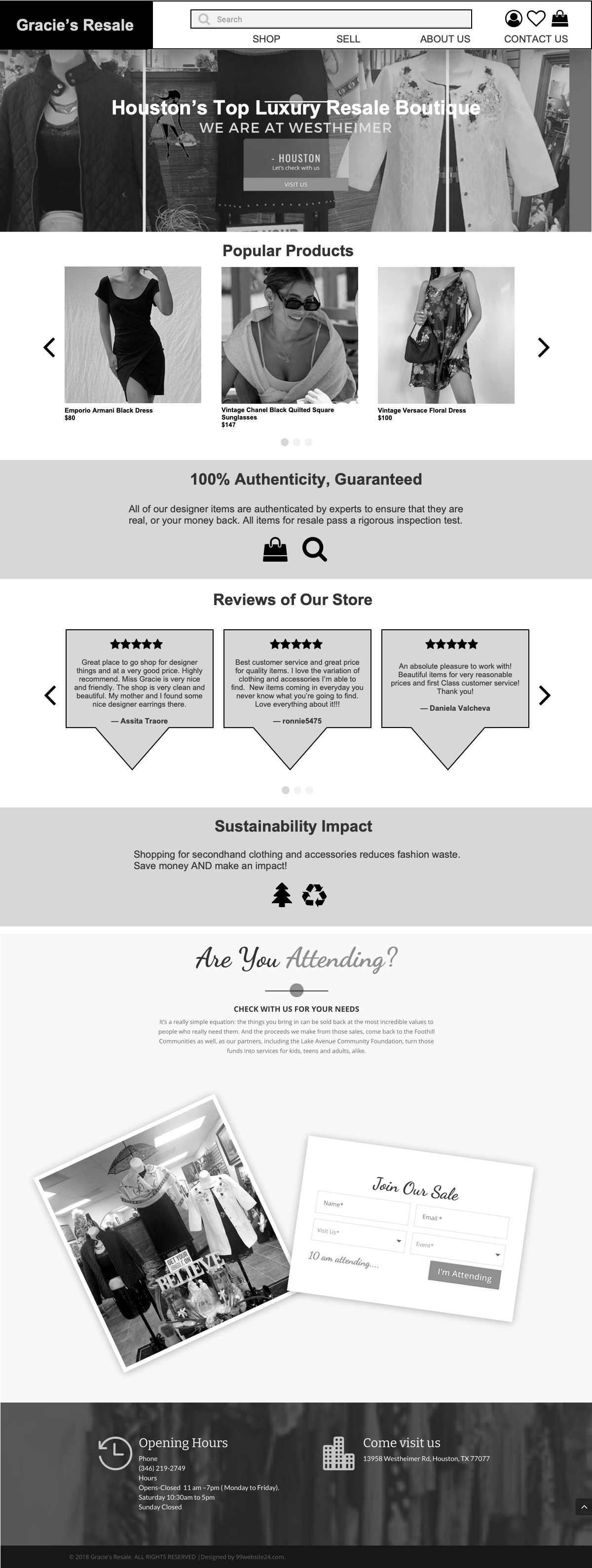
I designed an e-commerce function and other features (store reviews, contact us messaging, authenticity and sustainability guarantees) on Gracie’s Resale’s website. This will allow Gracie’s Resale to tap into the market of online shoppers by catering to their needs.
Goal & Outcome
Gracie’s Resale will expand its business with a new e-commerce function and online experience. Success would be measured through ROI and revenue, and e-commerce metrics like website conversion, cart abandonment, and customer lifetime value.
For an overview of the final product, watch this narrated video.
In this video, I walk through the user flow and functionality of my prototype along with the reasoning behind each feature. After viewing the video, you can scroll through the details of my design process.
Process Overview
1. Discover
Examination of Gracie Resale’s current website
4 user interviews with resale shoppers
Synthesis of interviews- feature list
Competitive analysis
Comparative analysis
2. Define
Card sorting- 7 open and 7 closed
Primary and secondary persona
Defining the problem
Defining features
“Saved For Later” feature
User flows
3. Design
Solution statement
Sitemaps
Sketches
Test prototype
4. Deliver
5 usability tests
Final prototype
Discover
First, I examined Gracie’s Resale’s current website to work with its existing structure.
You can see an overview of Gracie’s Resale’s website at the time of the project (currently, the company has taken its website down). There is a Home Page, a Westheimer Collection page, and a Contact Us page. There was no existing e-commerce functionality, and the website was very limited. You can view a video of its existing site below, and click through its pages.
I conducted user interviews to understand what motivates resale and online clothing shoppers, their experiences with resale shopping, what they expect from an e-commerce site, and the factors that influence them to make a purchase decision.
I asked about their goals, needs, wants, habits, and challenges with online and in-person resale shopping.
I recruited and interviewed 4 women, 2 who have shopped for resale products online, and 2 who have shopped for resale products in-person (but not online) and have shopped for retail clothing and accessories online. I asked the following questions:
Tell me about a time you shopped online for resale items. What site did you use? Can you walk me through all the steps. How did you feel about the experience and why?
Describe a time you shopped for resale items and how you made the purchase decision. What were all the factors you considered? Can you walk me through your whole process?
What are your goals and motivations in shopping for resale items?
What are your needs in shopping for resale items?
How often do you shop for resale items? How many times per month? Per year?
What do you expect out of an online shopping experience for resale items? Is it same as a shopping experience in regular online stores?
What are your problems as it relates to shopping for resale items?
What are your challenges as it relates to shopping for resale items (online)?
Do you prefer to shop online or in-person at a resale center? Why? How can a website be designed so that it is your preferred method?
Do you need/want a way to shop online for resale items? Why?
What information would you like to see when shopping for resale items online in order to make a purchase decision?
I recorded the 4 user interviews in soundtracks and transcripts below.
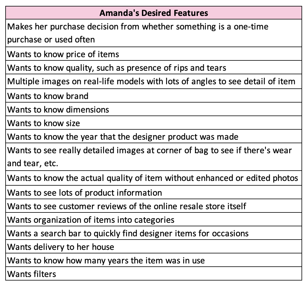
To synthesize the user interviews and make them actionable, I made a list of features that each person wants from an e-commerce site (below). This included features they said they wanted as well as what I inferred could solve their pain points. I also wrote down the must-have features from our General Assembly project brief (right).


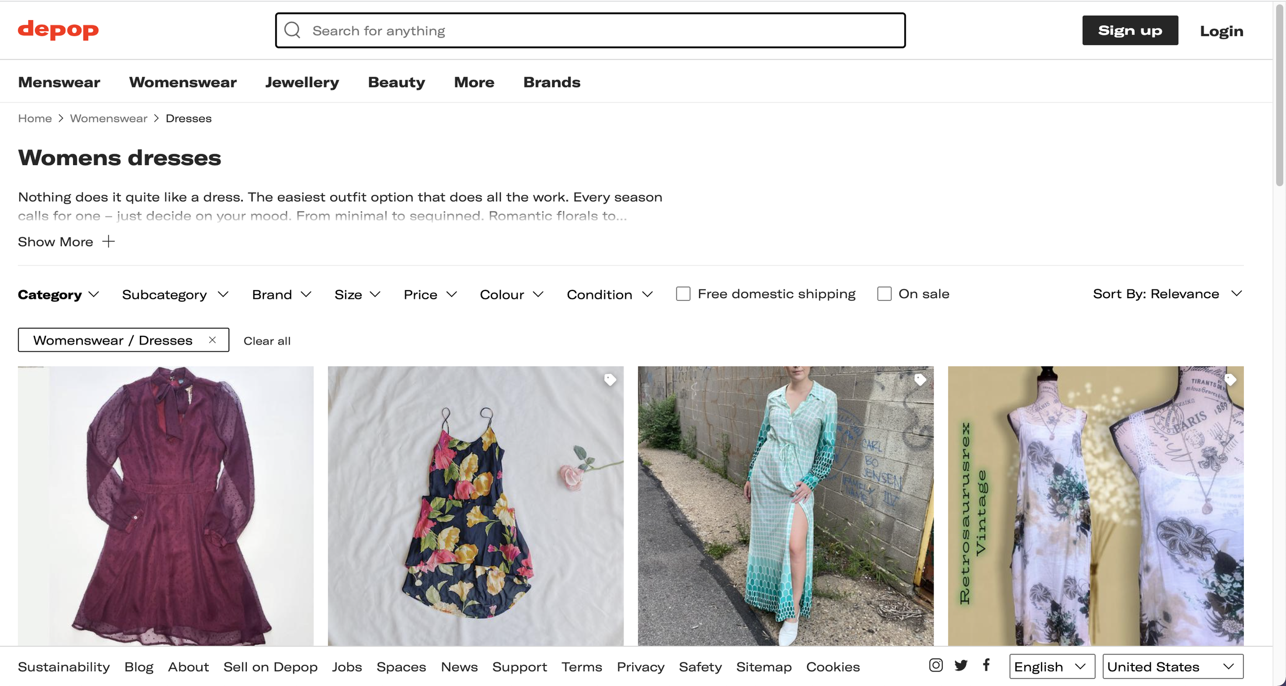
Next, I had to understand the market alternatives for online resale shopping and gather UX inspiration. I did a competitive analysis of local mom-and-pop resale shops and the top online resale and consignment marketplaces.
I analyzed the competitor sites’ strengths and weaknesses and noted their areas of product discovery, product detail pages, checkout process, authentication process, saved search features, and store reviews. I would use these sites for UX inspiration while prototyping my solution, especially depop.com, which was noted by my users to have clean UX & UI. I also referred to these sites while I did my sketching and wireframing later in the process.
Local Resale Shops
Online Resale and Consignment Marketplaces
To gather UX inspiration for my site, I did a comparative analysis of the best-rated UX across several e-commerce sites.
I looked at the Best Apparel & Accessories E-Commerce UX by Category by Baymard Institute. These included the Product Discovery section of Neiman Marcus, the Checkout Process of Nordstrom, the Product Page of Louis Vuitton, and the on-site search function of Walmart and Zalando. See screenshots below.
2. Define
To determine the organizational and navigational structure of Gracie’s Resale’s e-commerce function, I conducted a series of card sorting.
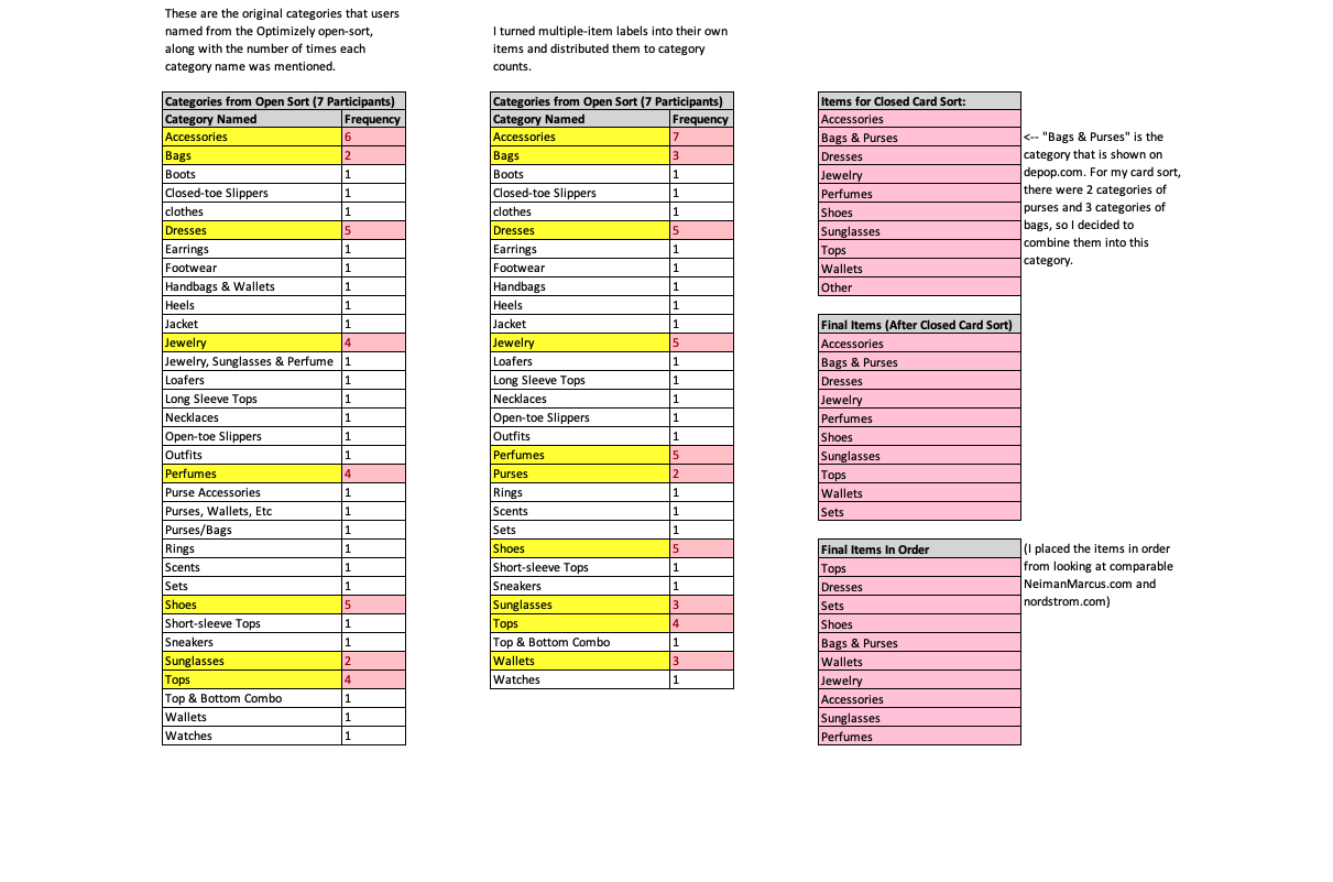
I gathered an inventory of 100 representative items from Gracie’s Resale’s Instagram. Then, I placed them on Optimizely for card sorting. I did an open card sort with 7 participants and a closed card sort with 7 participants. These participants were resale shoppers and/or online clothing shoppers. Thus, users selected the most intuitive names to categorize the items on Gracie’s Resale’s e-commerce site. Below, you can see the categories users named during the open card sort, which became the items tested for the closed card sort, and how I placed the final items in order from looking at categories presented in comparable e-commerce sites.
Synthesizing my user research, I created a primary and secondary persona to represent two types of online resale shoppers. These personas would guide design decisions.
I created the following two personas, Experienced Ella (primary) and Newbie Nelly (secondary), to represent typical resale shoppers that will use Gracie’s Resale’s e-commerce site. Ella is an experienced online resale shopper and is used to online resale marketplaces such as depop.com, thredup.com, and stockx.com, and expects a comparable online shopping experience. Nelly is new to online resale shopping and is used to shopping for resale items in-store; she’s skeptical of the online shopping experience. Nelly is a distinct persona because she wants features that give her a push to trust the online shopping experience and make it comparable to an in-store experience— she wants honest descriptions of the product and the fabric, and related features.
I wrote a problem statement to synthesize my research and define resale shoppers’ core problem.
“Resale shoppers need an efficient and trustworthy way to shop for resale clothing and accessories online, so that they can save time (as compared to buying in-store) and money (as compared to buying items at original price) and feel assured they will receive quality products.”
I defined features to include in the new website and e-commerce function using my user interviews request list, competitive and comparative analysis, requirements from the Project Brief, and some recommendations from the Nielson Norman Group.
Below I list the features to include in different sections of my new website and e-commerce flow as well as the reasoning behind each feature.
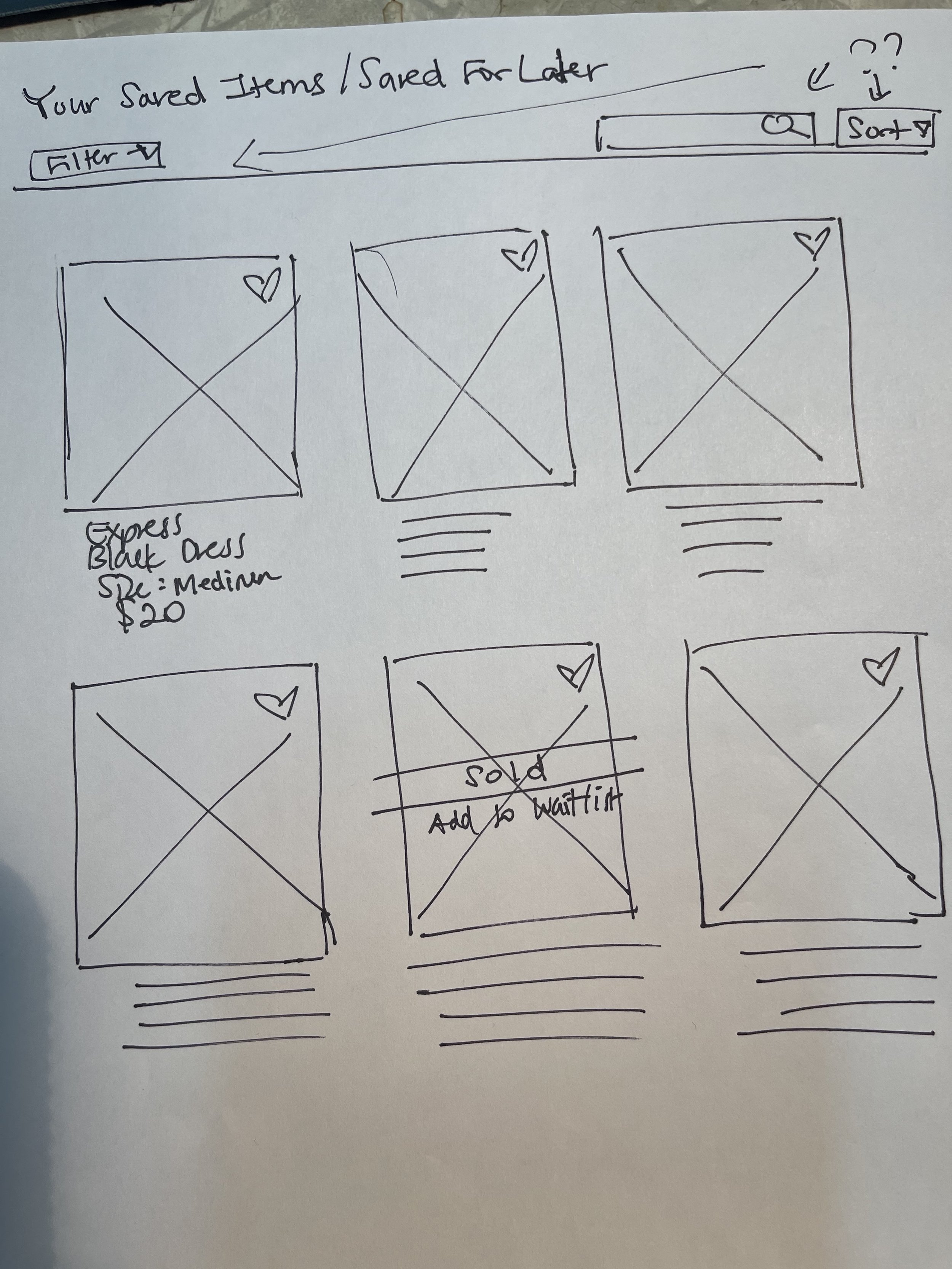
I created a section called “Saved For Later” based on the results of a Nielson Norman Group study.
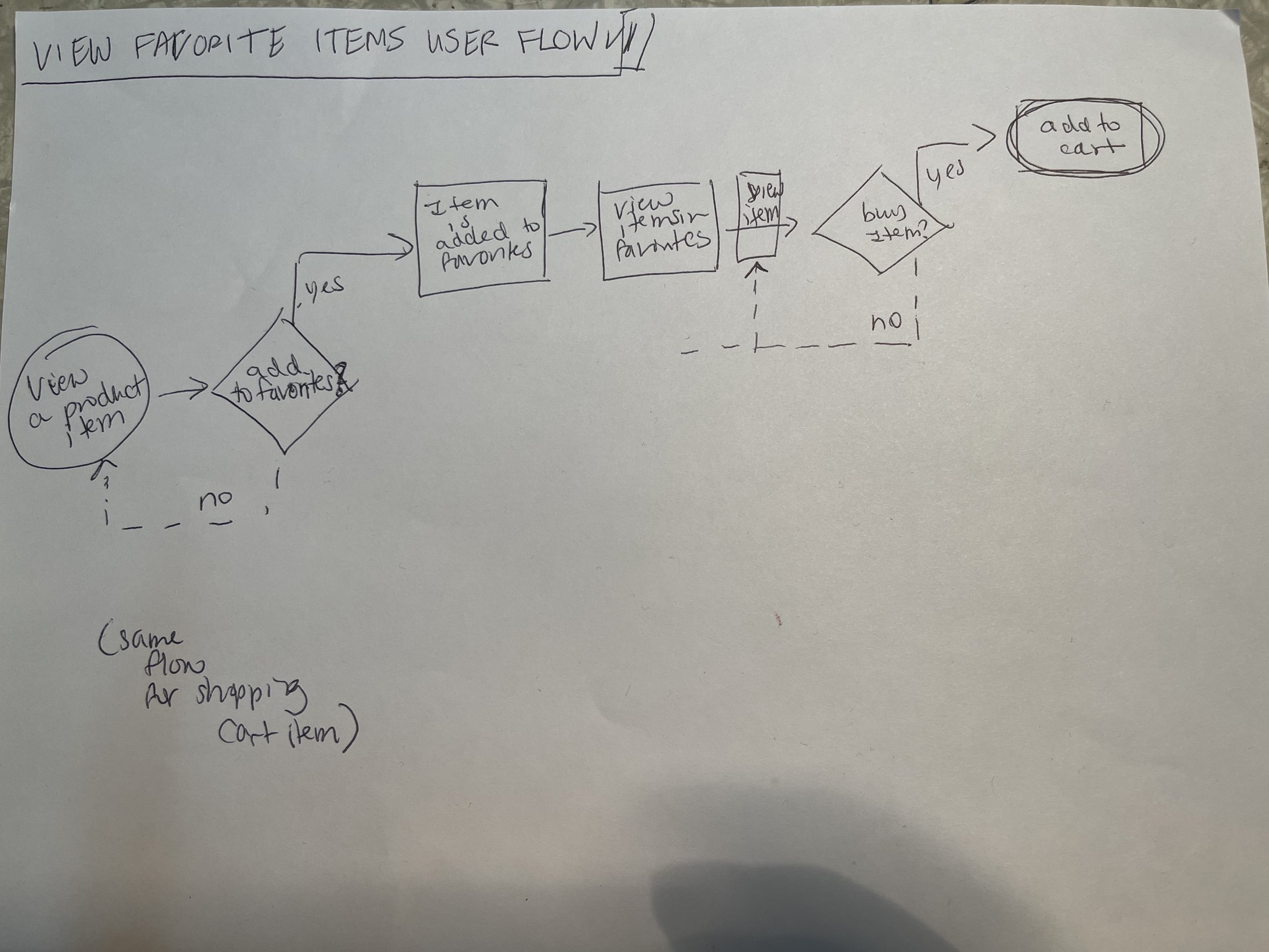
For our project requirements, we were to make three user flows: product discovery, checkout, and one other. I decided to create a section called “Saved for Later”. I read a study by Nielson Norman Group that found that e-commerce users became confused between an e-commerce site’s usual Save For Later section and the Wishlist or Favorites section, which are usually separate. (Tradesy.com, neimanmarcus.com, and nordstrom.com all have the option to "Save For Later" from the shopping cart, which places items in a different section than “Favorites”, which consists of items saved from clicking the heart icon on products in product lists, which Tradesy and Neiman Marcus have.) Based on the NNG study, on Wayfair.com, users would automatically assume that items that they “Saved For Later” during the checkout process would be saved in the Favorites or Wishlist section.
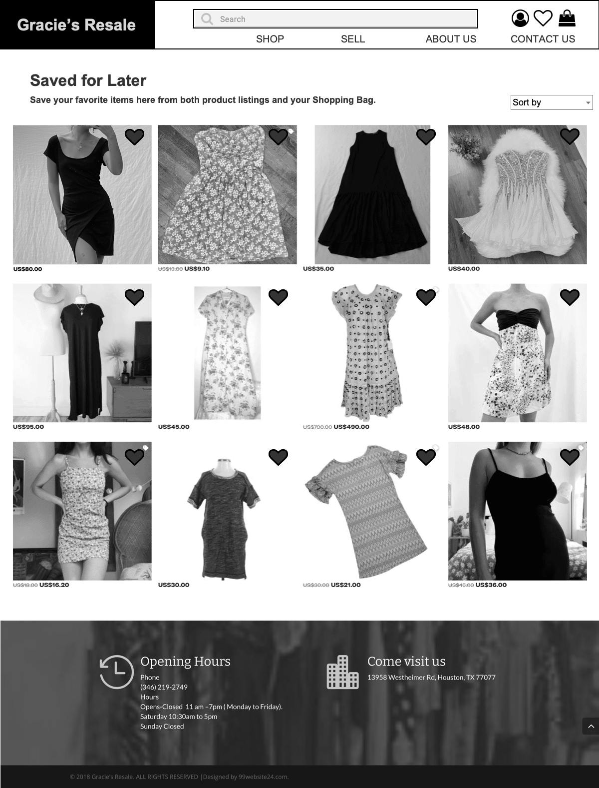
Thus, on my own e-commerce site, I combined both the traditional Wishlist or Favorites section with the Save For Later section, turning them into one section called “Saved For Later”. You can see the final wireframe of this section on the right. I planned to validate this feature during usability tests.
I created three user flows for the e-commerce function: product discovery, saved for later, and the checkout process.
You can see my user flows (sketches and digital versions) below.
Product Discovery User Flow Sketch
Saved For Later User Flow Sketch
Checkout User Flow Sketch
User Flow- Product Discovery
User Flow- Saved For Later
User Flow- Checkout
3. Design
I wrote a solution statement to hypothesize and define what the new Gracie’s Resale website and e-commerce functionality should accomplish.
“I believe that by developing an e-commerce capability and other features (store reviews, contact us messaging, authenticity and sustainability guarantees) on Gracie’s Resale’s website, I will allow resale shoppers to efficiently shop for quality resale clothing and accessories online in a way that inspires trust and is comparable to other online shopping experiences.”
I made a sitemap in order to illustrate the navigational and organizational structure of Gracie’s Resale’s website.
I made several sketches and versions of the sitemap below, along with a digital version.
SiteMap Version 1
SiteMap Version 2
Digital SiteMap
I made a series of sketches below to illustrate the flow, features, and layout of Gracie’s Resale’s site and e-commerce functionality.
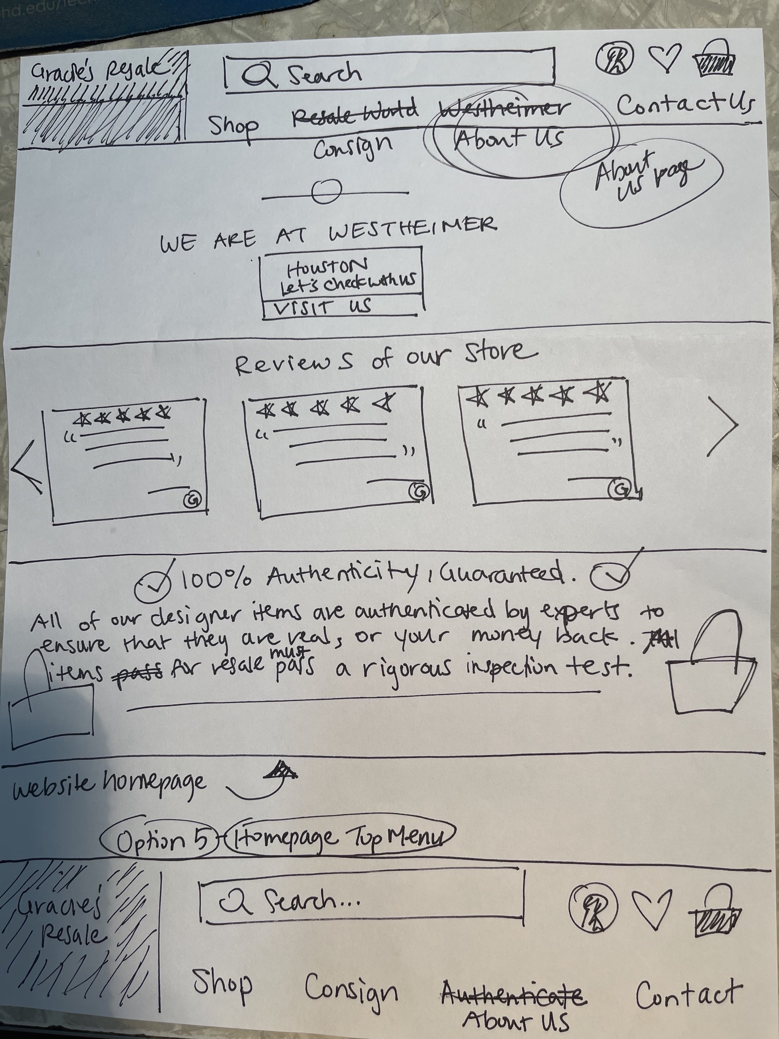
Home Page Version 1
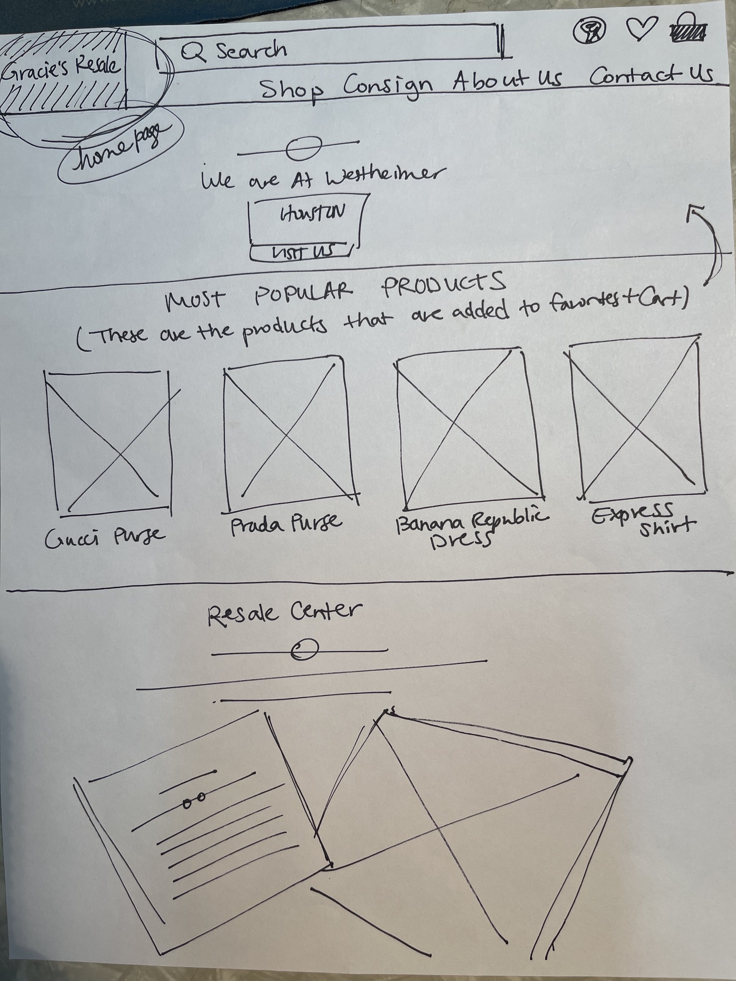
Home Page Version 2
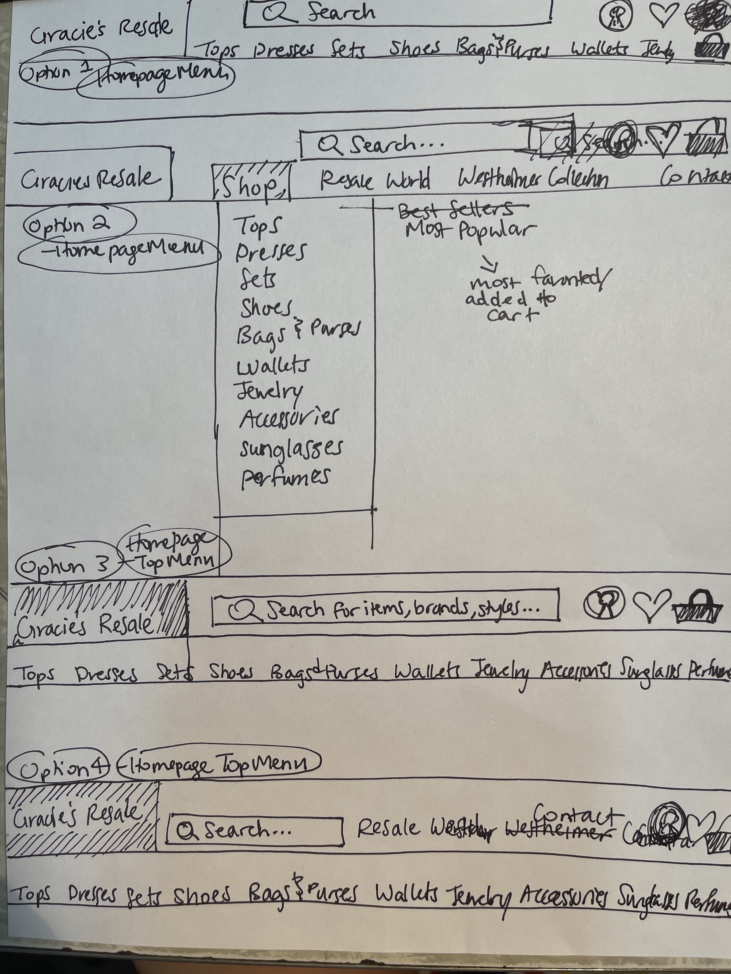
Top Header Options
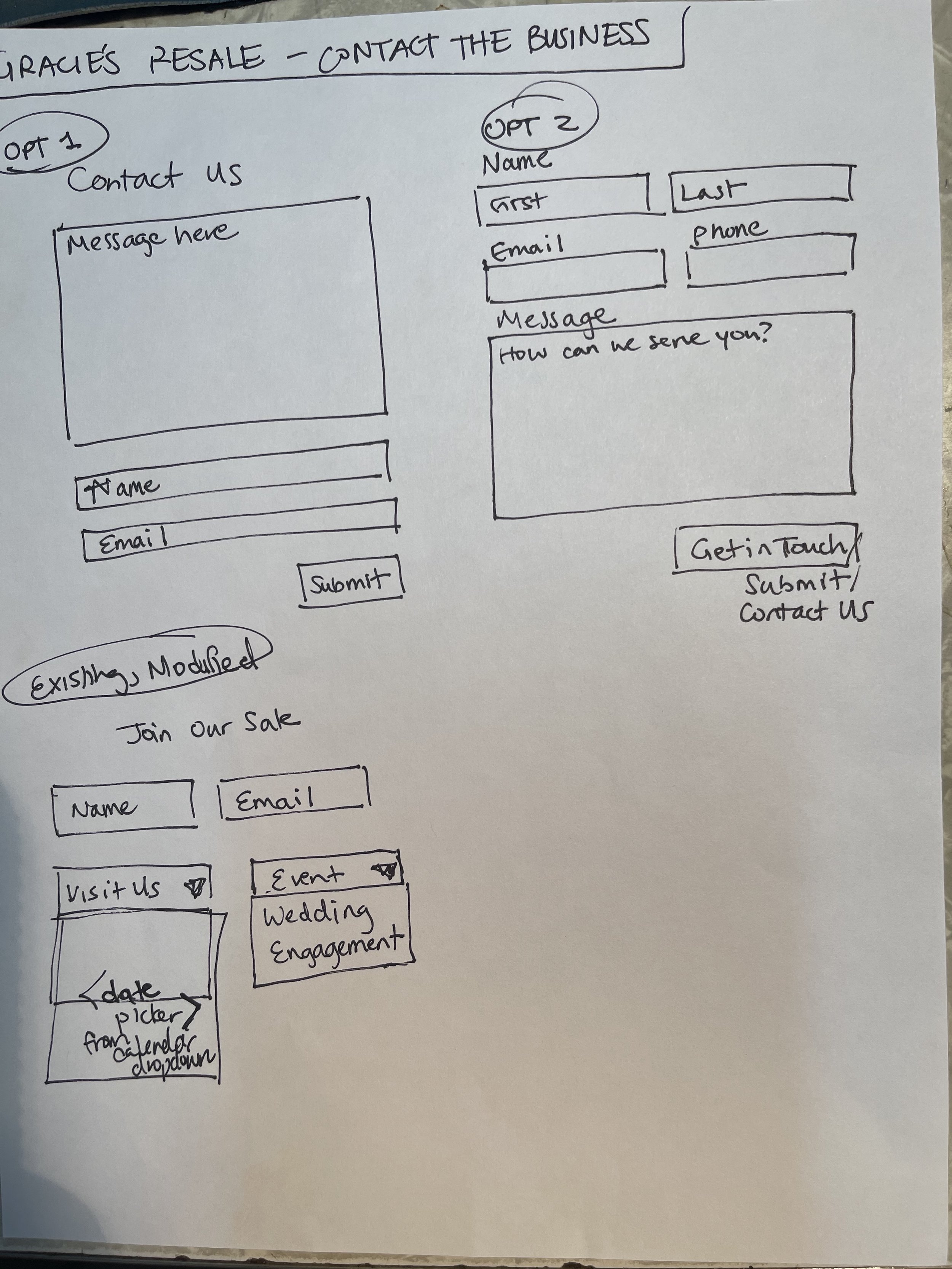
Contact the Business
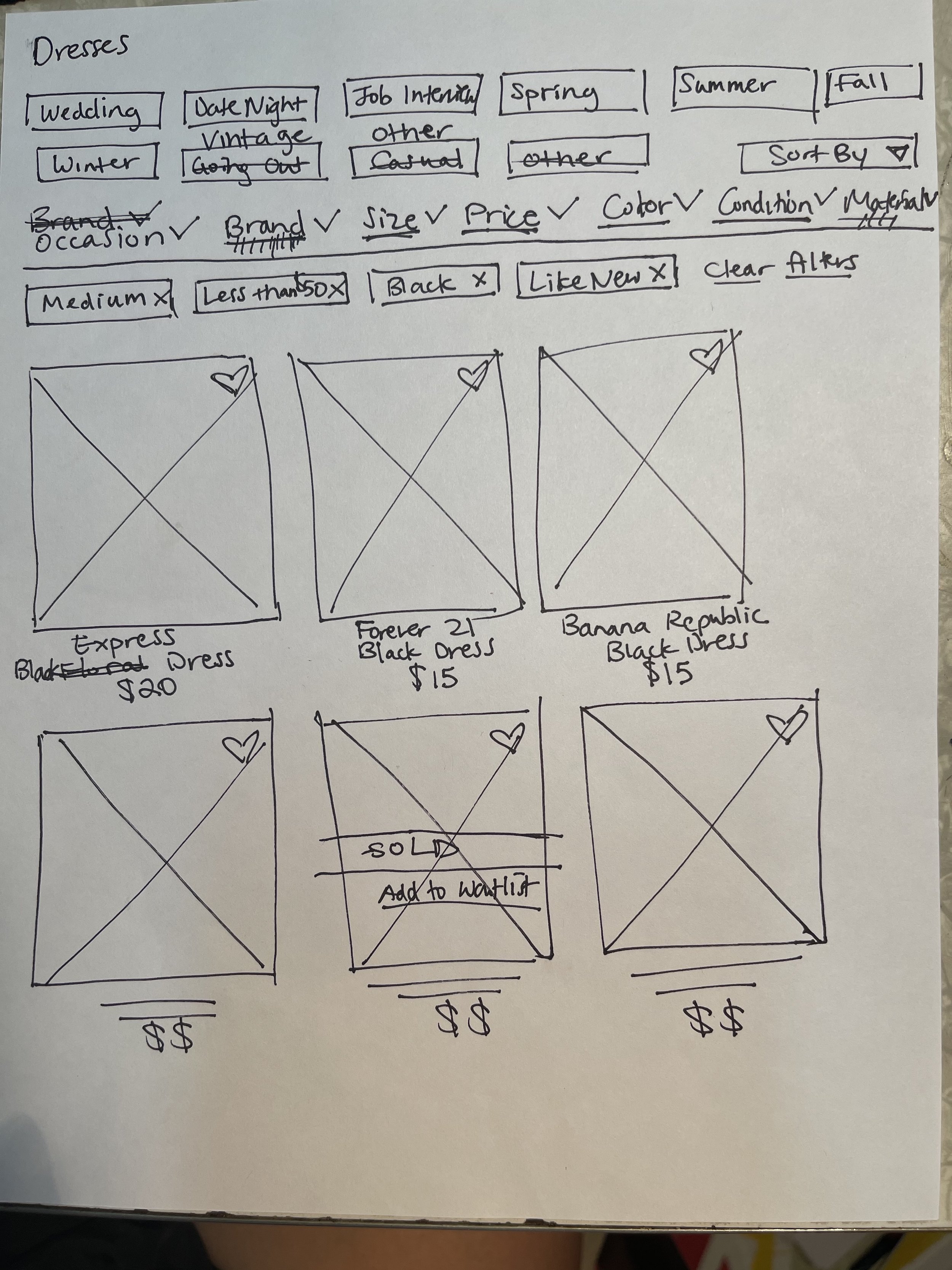
Product Discovery- Dresses Product List

Product Discovery- Dress Product Detail Page
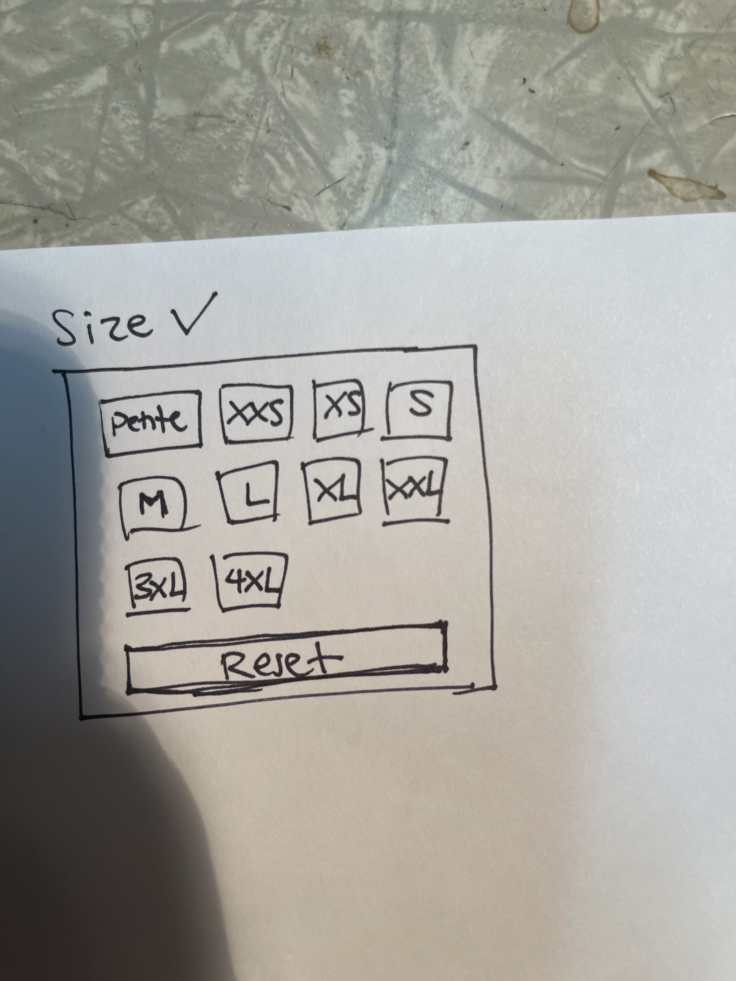
Size Filter Dropdown Option

Checkout- View Shopping Bag
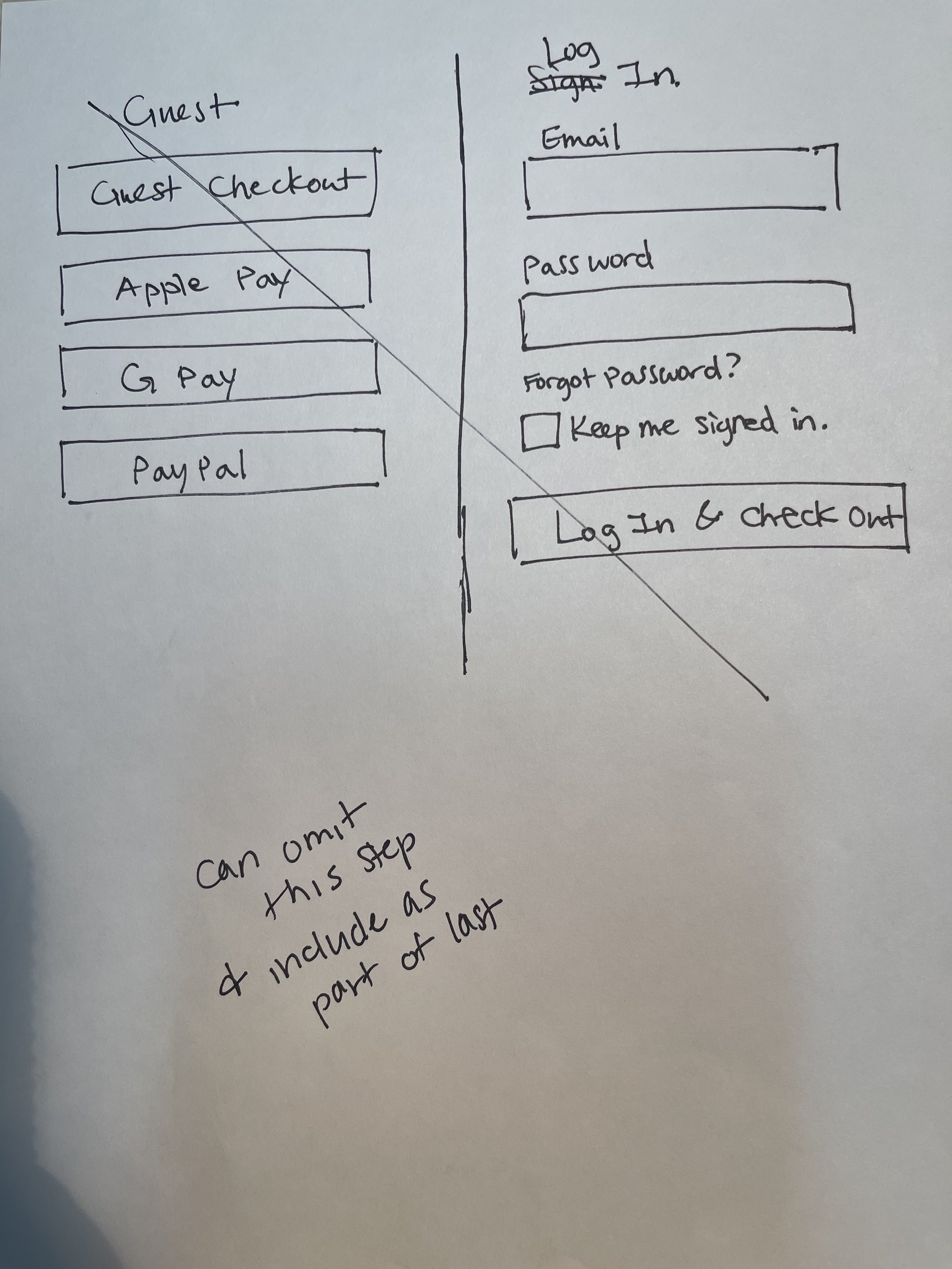
Checkout- Login
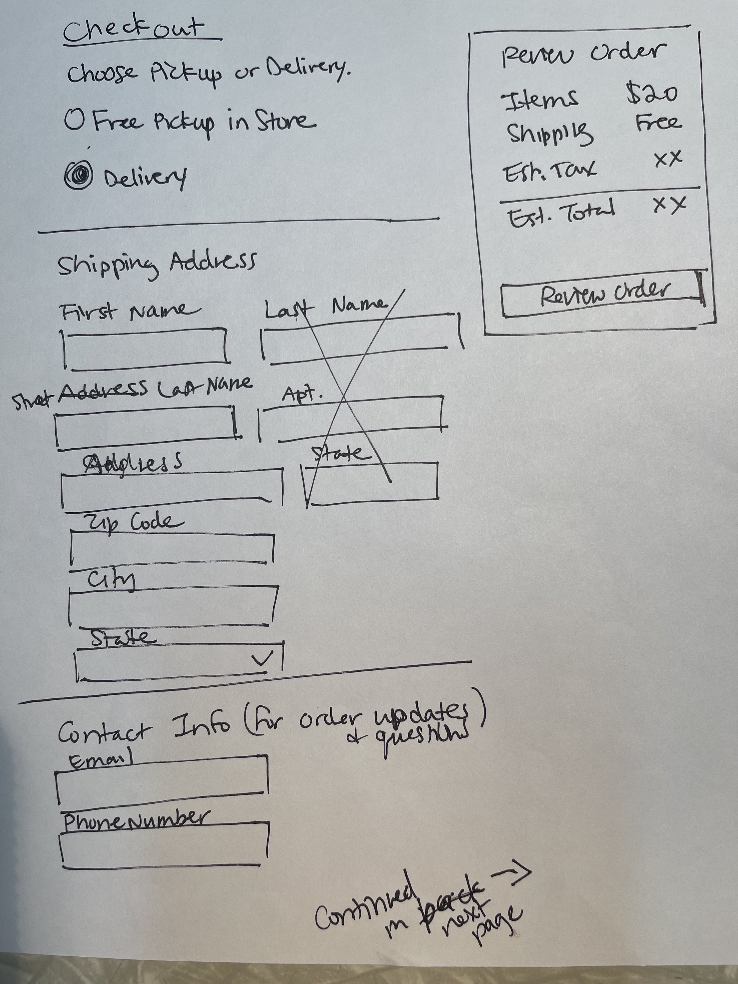
Checkout- Delivery Method, Address, and Contact Information
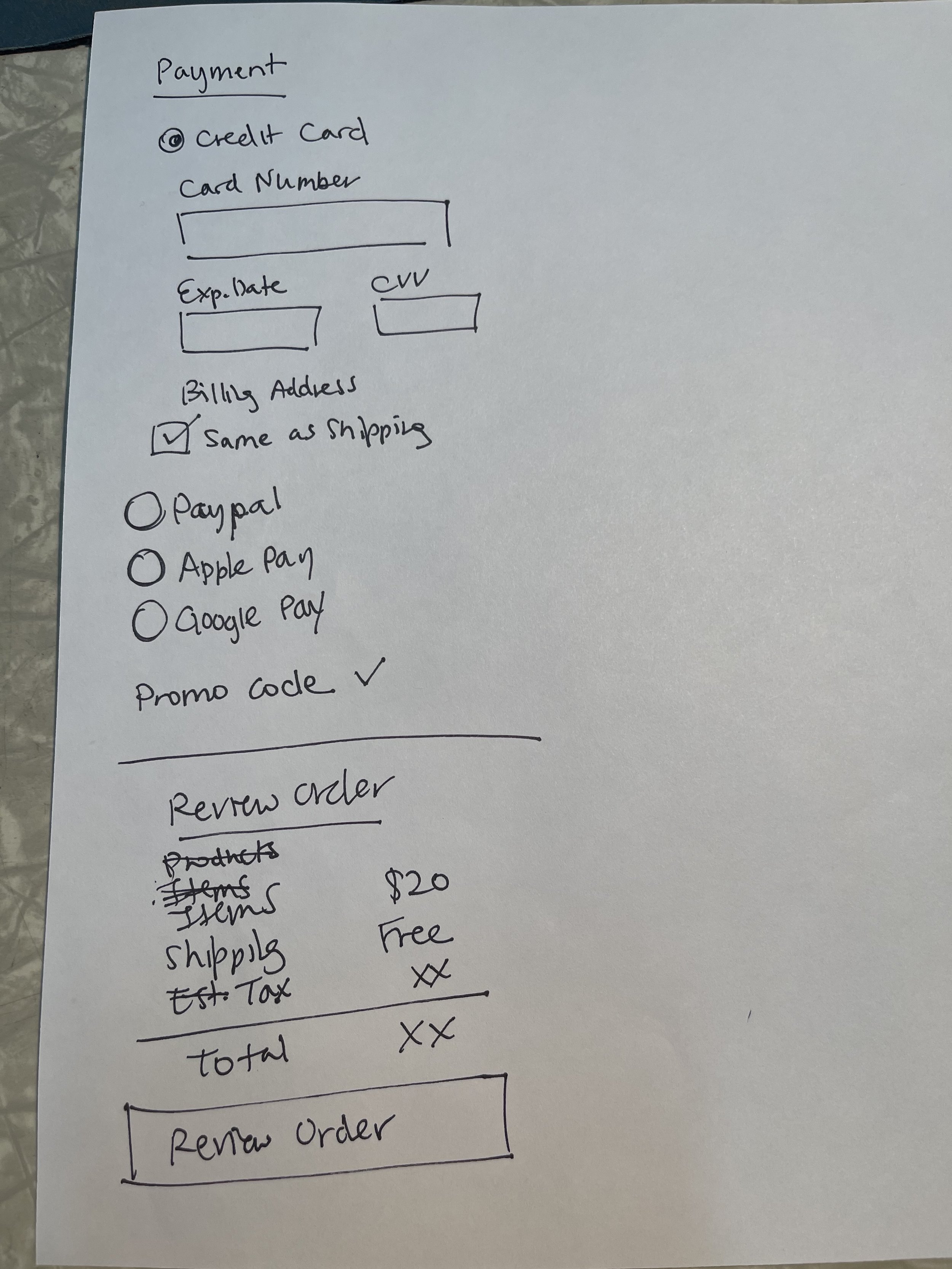
Checkout- Payment and Review Order
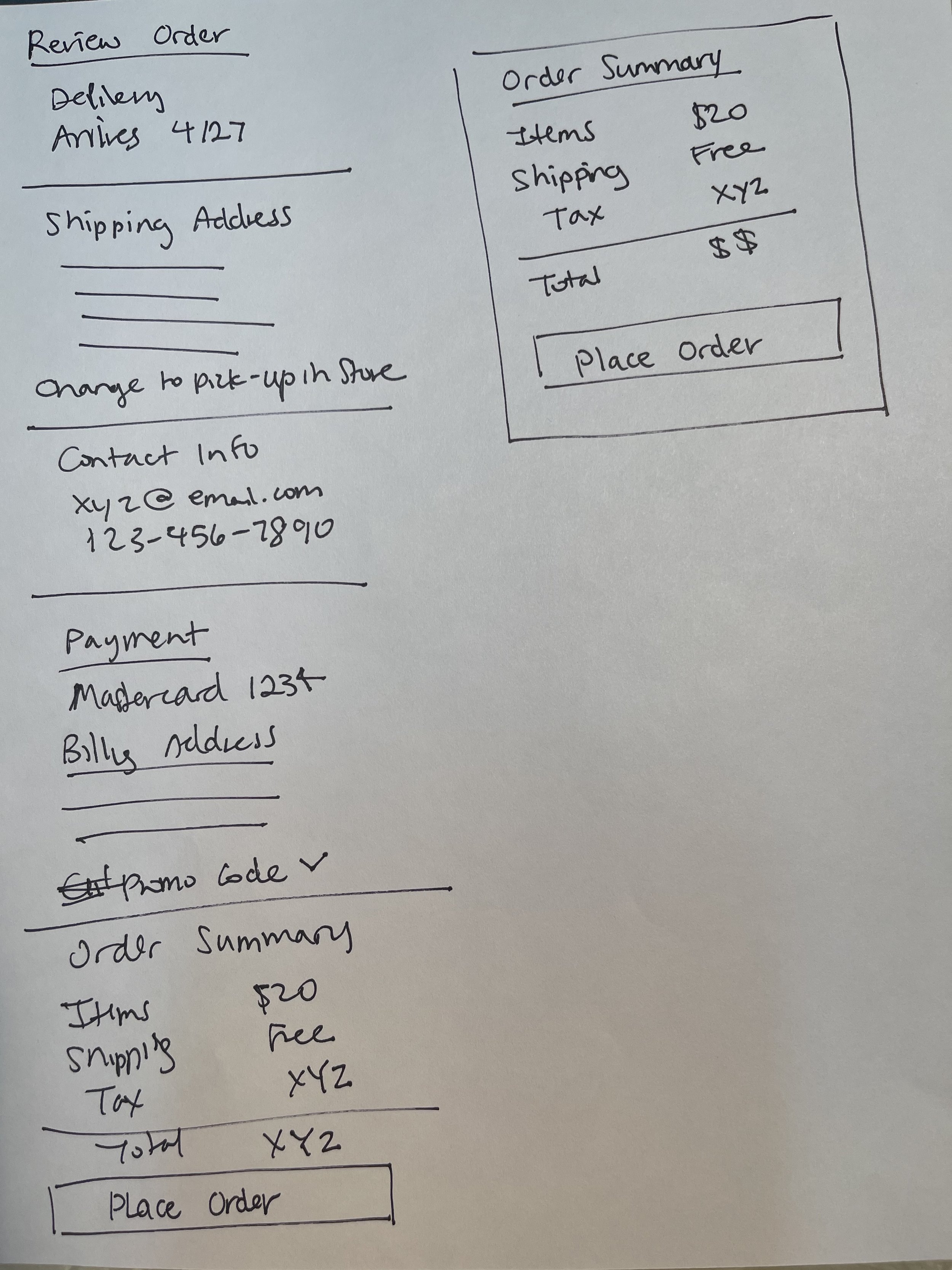
Checkout- Review Order
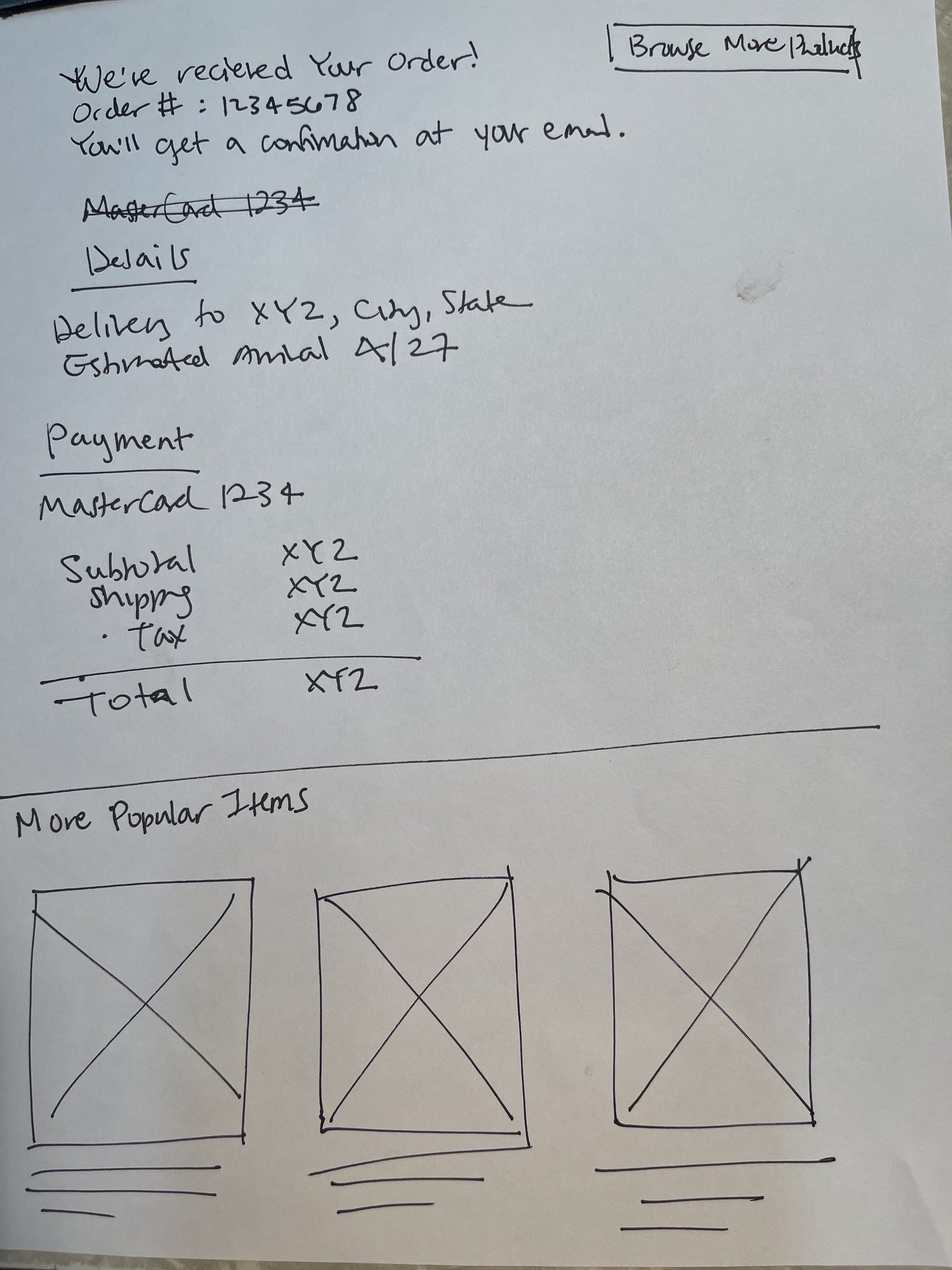
Checkout- Order Confirmation
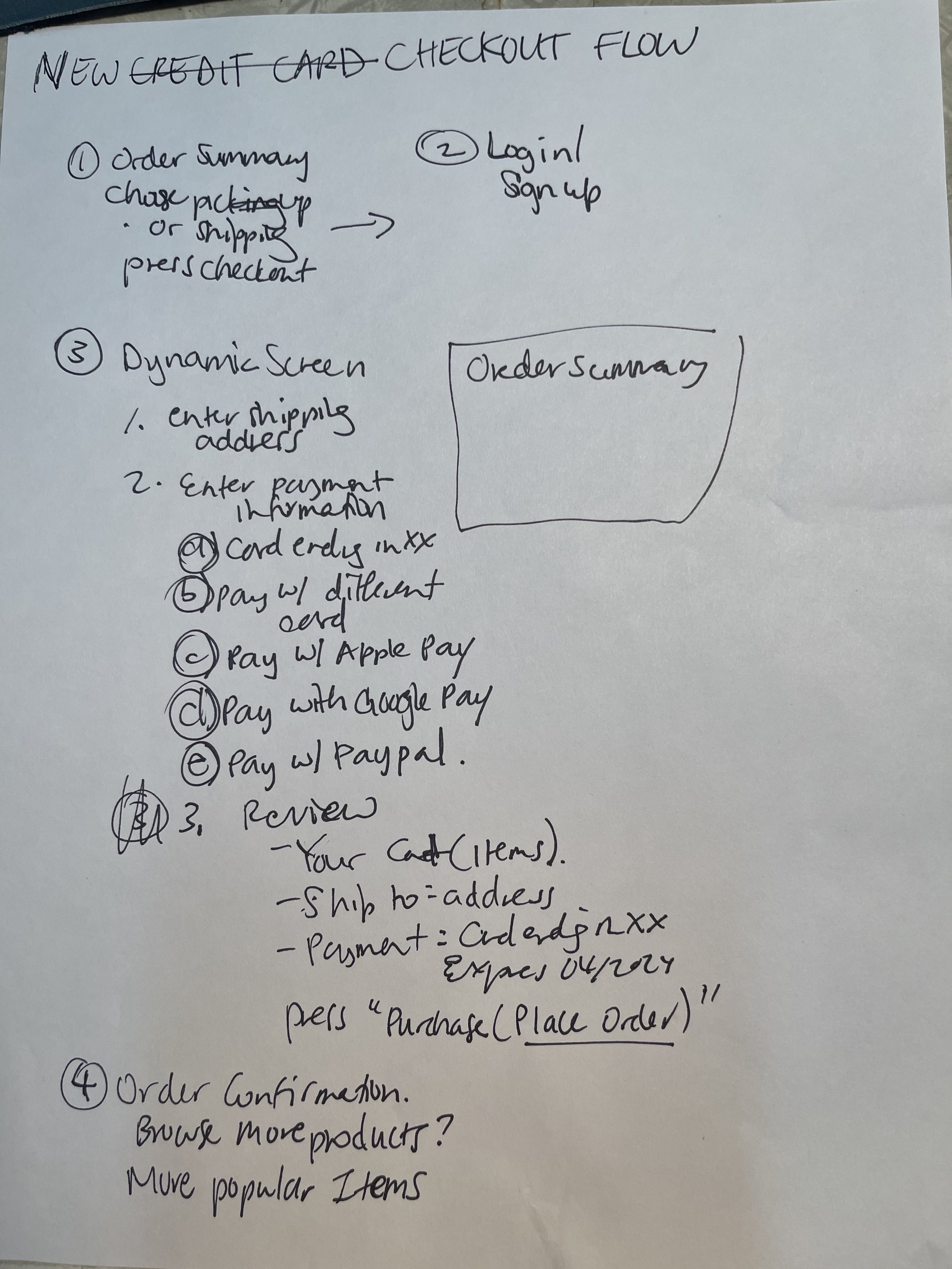
Checkout- Axure Flow Steps
Saved For Later Page
I made the first version of a prototype in Axure RP to test with users.
4. Deliver
I conducted 5 usability tests on my test prototype to identify gaps in usability.
The goal of this test is to uncover whether certain key functions of the application are easily findable and usable, whether the functionality, navigation, and labels within the app are intuitive, and whether the app solves the users’ main problems quickly and efficiently.
This test was conducted remote moderated over Zoom for 4 participants. It was also conducted live in person with 1 participant while being observed and moderated when needed. I made a usability test plan with 9 tasks and 7 additional questions to gather feedback.
Participants were screened beforehand to make sure they fit at least one of the following criteria:
1) Shopped for resale or secondhand clothing or accessories online
2) Shopped for resale or secondhand clothing or accessories in-person
3) Shopped for designer clothing or accessories
4) Shopped for clothing or accessories online
Watch my usability test videos.
Watch my videos below with 5 participants to see their reactions and feedback to the site.
Karen’s Usability Test
Kathy’s Usability Test
Diana’s Usability Test
Paige’s Usability Test
Amanda’s Usability Test
I tested 9 tasks and 7 follow-up questions.
See a summary of the tasks, metrics, results, and comments below. The bolded comments are significant findings that informed my changes to the site.
I iterated on the prototype from the usability test results, making several revisions to the wireframes.
•The “Saved for Later” section was intuitive for users, so I kept this layout.
•3/5 users suggested changing the font of Gracie’s Resale’s logo to look more professional. I changed the font from Comic Sans to Arial Bold.
•3/5 users did not know what the word “Consign” meant in relation to selling secondhand clothes. I changed the category label “Consign” to “Sell”, and changed the Header on the Banner Logo from “Houston’s Top Luxury Consignment Boutique” to “Houston’s Top Luxury Resale Boutique”.
•A user noted that the price was missing on the product detail page. I added the price.
•A user wanted to be able to buy pants in the category dropdown. I added the category “Bottoms” to correspond with the existing category “Tops”— the “Bottoms” category would encompass shorts, skirts, and pants. I determined the order of this category in the dropdown menu by using depop.com’s categories as a guide.
Changing the Logo from Comic Sans to Arial Bold and Revising “Consign” to “Sell” in the Global Navigation
Original Website Global Navigation Menu
Test Prototype Global Navigation Menu
Final Prototype Global Navigation Menu
Revising the Header to say “Resale” instead of “Consignment”
Original Website Header
Test Prototype Header
Final Prototype Header
Adding Price to the Product Detail Page
Product Detail Page without Price- Test Prototype
Product Detail Page with Price- Final Prototype
Adding “Bottoms” to the “Shop” Product Categories
Shop Dropdown Test Prototype
without “Bottoms”
Shop Dropdown Final Prototype
with “Bottoms”
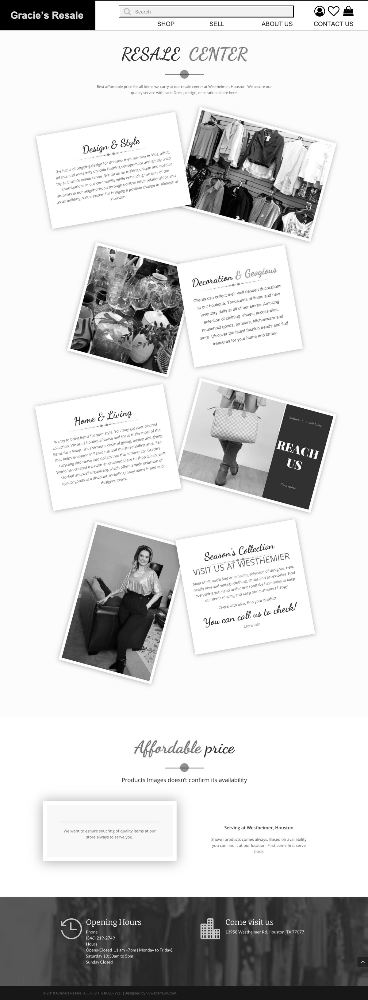
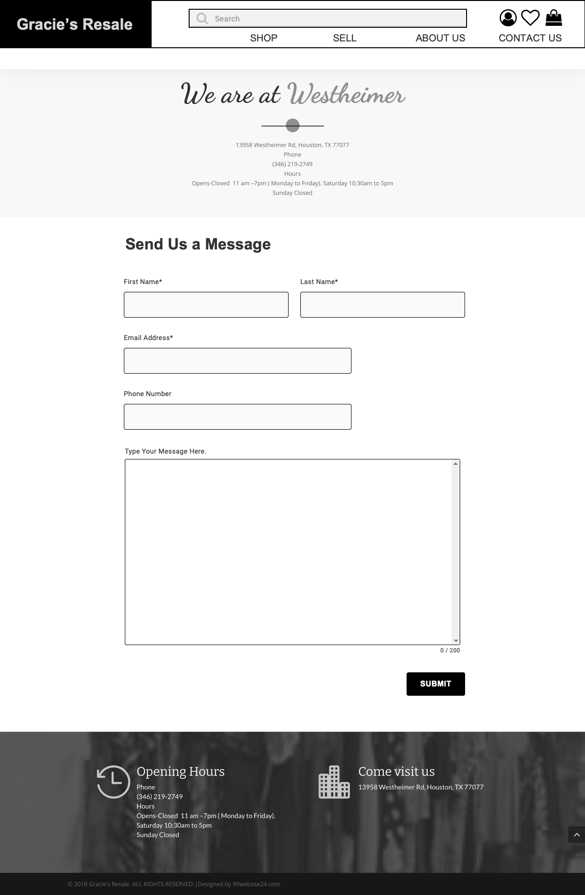
After revisions from the usability tests, I made final wireframes in Axure RP.
I prorotyped screens below.
Home Page
About Us Page
Contact Us Page

Dresses Product List

Medium Dresses Product List
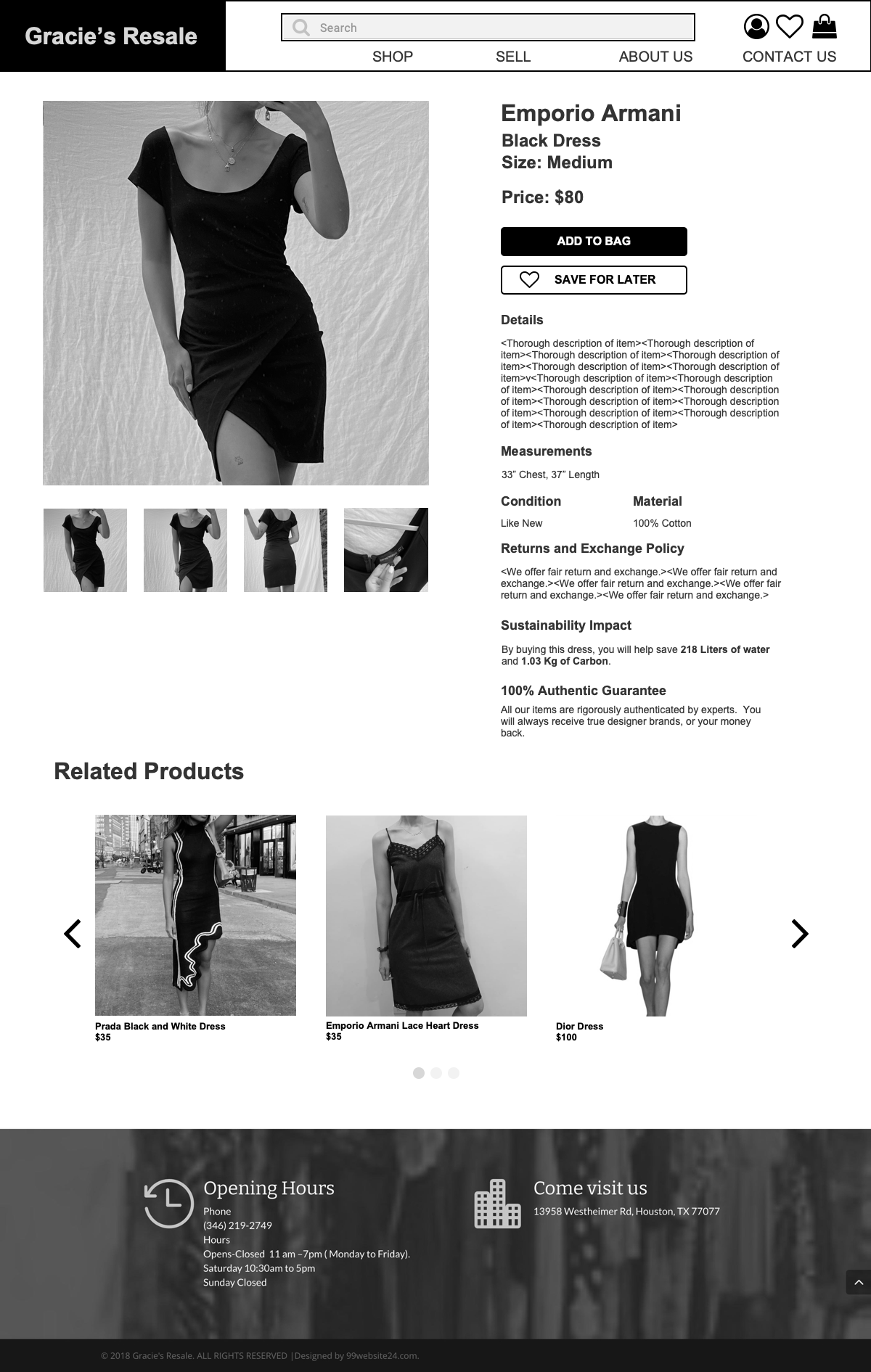
Product Detail Page
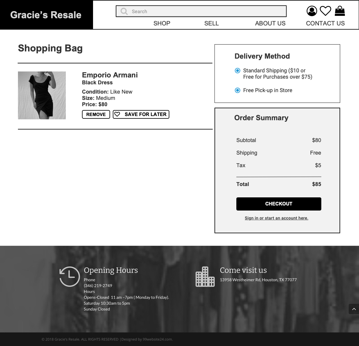
View Shopping Bag
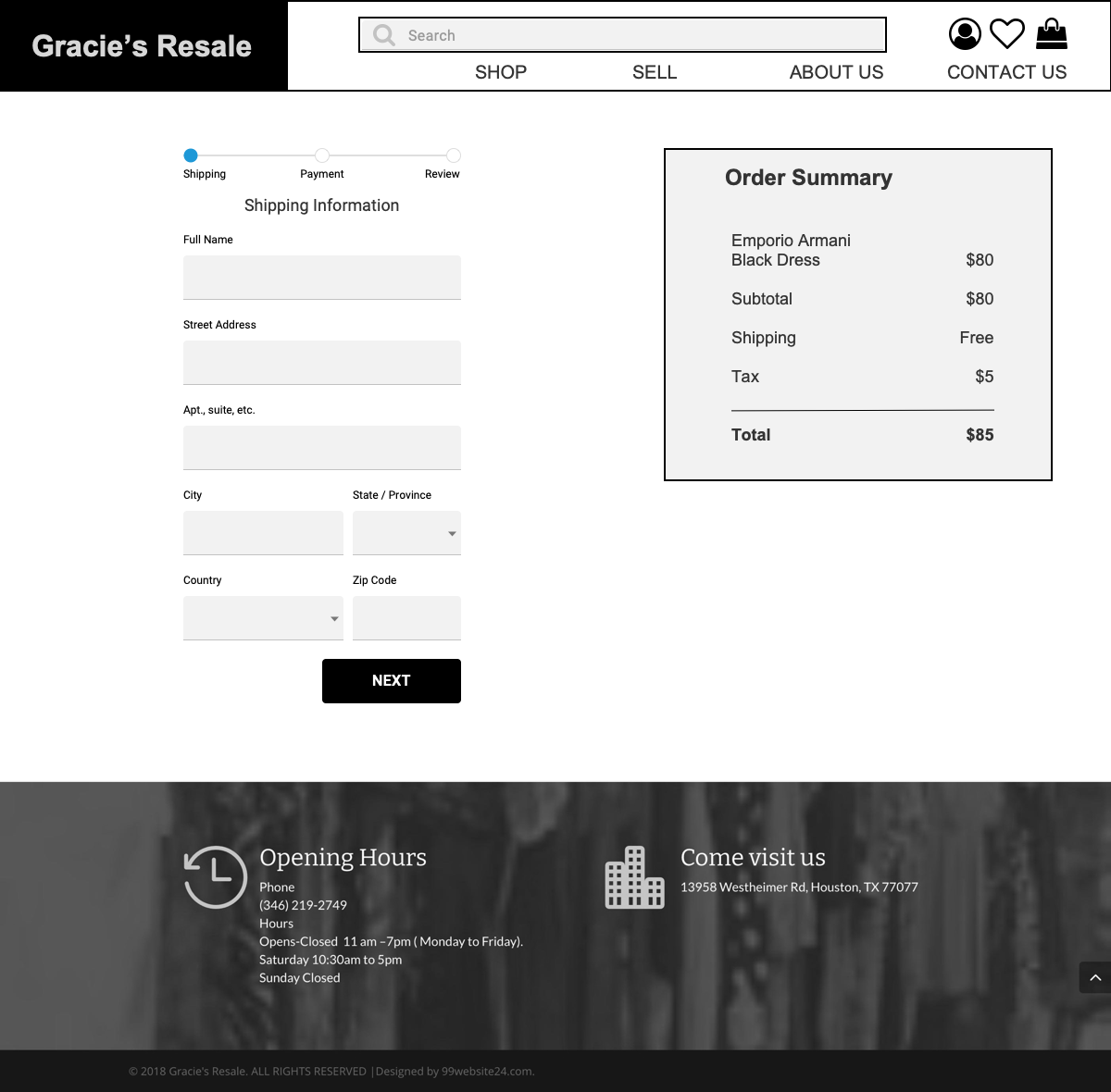
Shopping Bag Checkout Process

Shopping Bag Order Confirmation
I turned the wireframes into a final interactive prototype.
Based on other usability test suggestions, I made a list of design considerations for future iterations.
•Add a “Return and Exchanges” detailed policy page under the “Account” section
•Improve the filter dropdown for the price to indicate a range
•Improve the filter dropdown for size to be a size chart
•Improve filters to allow the user to select more than just one choice
•Ability to navigate to social media pages


