
Microfeedback: real-time, instant feedback on Chase internal products


Project Overview
What is Microfeedback?
Microfeedback surveys are small, quick, and targeted feedback questions that users can answer while they are interacting with software. Users can submit feedback in-flow in seconds- these questions can be in many forms, including rating scales and quick polls.
My Role
I served the role of a Senior UX Designer while working with two other lead designers. My significant contributions included researching microsurvey design practices and common questions, writing a list of questions, and designing our module.
Project Background
In the Service Product Group within Chase, we aimed to design microfeedback surveys (as microservice, plug-and-play modules) for our internal products. After implementation within our group, we will expand this service to all Chase products.
Timeline
January 2023 - Present
Challenge
There was no current mechanism for the Service Product Group to collect instant, mass amounts of data about product success. We didn’t have enough access to how call center specialists and branch bankers view our internal apps without doing extensive legwork.
Skills & Tools
Concept Design & Exploration, Synthesis, Competitive Analysis, Internet Research, Copywriting, User Flows, Ideation, Sketching, Wireframing, Interaction & Visual Design, User Interviews on the Concept, Prototyping, Figjam, Figma
Solution
Microfeedback is a way to consistently get data to drive development, based on constant feedback loops of human-centered design. Our product team would have mass amounts of real-time qualitative and quantitative data from the call center and branch bankers.
Goal & Outcome
Short-term goals include ensuring sufficient responses, mid-term goals include action from responses, and long-term goals include using microfeedback as a regular touchpoint, benchmarking product modules, and expansion of Microfeedback to other Chase teams.
For a quick overview of the final product, watch this narrated video.
In this video, I walk through the user flow and functionality of our prototype along with the reasoning behind each feature. After viewing the video, you can scroll through the details of our design process.
Process Overview
1. Research
Internet research on microfeedback best practices
List of common microsurvey questions
Competitor analysis of other microfeedback designs
Examination of Chase’s design system
Examination of the first product module for microfeedback
2. Synthesis & Ideation
Compilation and synthesis of research
Design of Form Factors- the types of potential microfeedback designs
Sketches
User flow
3. Design
Microfeedback questions
Lo-fi wireframes of multiple forms
Hi-fi wireframes
Hi-fi final design and copy of ease-of-use MVP question and in-line survey in the first module
4. Prototype & Test
Hi-Fi Figma prototype
Concept questions to potential users

Research
At the beginning and throughout our design process, I examined Bumble’s current infrastructure to learn about the app’s capabilities, features, and constraints, and how we could incorporate this new feature into their existing flow.
Bumble currently has 3 “modes”: Date mode for dating, BFF mode for finding friends, and Bizz mode for business networking. Our feature is a fourth mode for finding roommates, which we named “Roomiezz”. (After our usability tests, we chose this name based on user feedback and Bumble’s brand). A constraint we faced was Bumble’s existing infrastructure, and we had to ensure that our ideas stayed consistent with Bumble’s functionality and brand. I primarily took on this responsibility by thoroughly understanding the product.

We analyzed 3 roommate finding apps to understand the market and users’ expectations.
We analyzed the top 3 roommate-finding apps on the App store and Google Play store: RoomEasy, Roomster, and SpareRoom. We conducted a feature inventory (a comparison of features) and a plus/delta (analysis of strengths and weaknesses). I was responsible for analyzing SpareRoom. After we each analyzed one competitor, we shared impressions.
Our competitor analysis helped us understand the current alternatives for roommate searching. Unlike these apps, we would differentiate by focusing on personal connections rather than housing preferences, staying consistent with Bumble’s mission.
We discovered the factors that people search and filter for roommates by, as well as the information listed on profiles. Below, I list the relevant factors from our feature inventory that would later inform our design decisions.

We conducted user interviews to understand roommate searchers’ needs, preferences, current search methods, and motivations.
We recruited and interviewed 7 people in their 20s and 30s who looked for roommates now or in the past, 5 of whom were Bumble users. I recruited and conducted 3 interviews. These are a few of the questions we asked our interviewees:
“Tell me about the last time you had to look for a roommate. Describe your circumstances and what you were looking for.”
“How did you search for a roommate? What methods or tools did you use?’
“How was your experience with your roommate? If negative, what do you wish you had known at the beginning?”
“What would your perfect roommate be like?”
“What are your goals, motivations, and frustrations when searching for a roommate?”
“How important are the following factors when searching for a roommate…”
After our interviews, we synthesized our research collaboratively with affinity maps on Miro.

1. Writing insights from our interviews onto sticky notes

2. Grouping our insights into intuitive categories

3. Writing “I statements” for each category
We learned that roommate searchers look for common important factors such as smoking habits, pet ownership, cleanliness, and matching housing budgets.
They found current roommate search methods (such as Facebook and word of mouth) time-consuming and inconvenient.
Additionally, they were frustrated with past roommate experiences and wish they knew more about their roommates ahead of time.
Thus, we validated the need for a roommate-searching platform and found important information on users’ search criteria and selection factors.
We found these common sentiments across our interviews and wrote them in the form of “I-statements” from our users’ perspectives. In hindsight, I also added some additional sentences/phrases for insight (factors that were not important not listed).
“Knowing about my roommate’s smoking habits is extremely important to me. I would prefer someone that doesn’t smoke inside the apartment.”
“Knowing if my roommate owns a pet is extremely important to me. If I have a dog, I would prefer a roommate that doesn’t have pets.”
“My roommate’s cleanliness level is very important to me. I want a roommate that’s clean but not too perfectionist about cleaning.”
“I want to know my roommate’s cleaning habits and discuss how clean to keep our shared space.”
“Finding a roommate whose budget matches mine is very important to me.”
“I would like to know if my roommate works from home. If I work from home, I would prefer my roommate doesn’t.”
“Knowing about my roommate’s noise level is very important to me. I want to be able to sleep.”
“Knowing how often my roommate will invite guests over is very important to me. I want to know when they have friends over, and I don’t want any overnight guests.”
“I would like to know my roommate’s gender, as I often prefer the same gender.”
“I would like to know my roommate’s age as I prefer someone who is at the same stage of life.”
“I would like to know what my roommate wants out of a housing relationship. I want to know how they like to communicate and that we’d be on the same page.”
“I would like my roommate’s profile to be verified so I know they are legitimate.”
“My ideal roommate is a good communicator, considerate, friendly, respectful, has shared interests or lifestyle, has positive personality traits and character, and doesn’t party a lot.”
“I would like to know my roommate’s occupation, but it’s not a selection factor. It would just be good to know to see if they’re also a young professional.”
“My roommate’s education level is good to know, but not a selection factor.”
“I would like to know my roommate’s drinking habits but it’s not that important.”
“Distance of where they want to live vs. where I want to live is moderately important to me. I want someone who wants to live in the same area I do, but I may be willing to budge for the right person.”
“I search for roommates through social media and word of mouth.”
“I am frustrated with my roommate search process due to limited filters and search options, the amount of time it takes, and tedious tools like Facebook where you have to manually vet people.”
“I was frustrated with my past roommate experiences due to lack of communication, poor division of space, invasion of space, poor division of chores, overnight guests, and other habits.”
“My goals and motivation for finding a roommate are financial security by splitting rent, to find someone within my monthly budget, and to find someone who I can get along with and feel safe with.”
“My goals and motivations with my roommate are to find someone I can be friends with, feel comfortable with, have shared interests, and someone with whom I can split rent.”
2. Define
We created a persona to represent our users and help us keep them in mind throughout our design decisions.
My teammate made the following persona, Riley Smith, to illustrate our roommate searcher. I reviewed the persona and added suggestions and edits.

Keeping Bumble’s mission in mind, I wrote a problem statement to synthesize our research and define our users’ core problem.
“Riley needs an efficient and targeted way to search for and establish potential roommate connections so that she can find a roommate that matches her desired preferences and sustain a healthy roommate relationship.”
I defined features using our user research and competitive analysis while accounting for Bumble's business model, capabilities, and constraints.
Our Roomiezz section mirrored the capabilities of other sections within Bumble- Date, BFF, and Bizz, but differed based on features for roommate searchers. Most of our design decisions were in the Edit Profile section, where users fill in profile information, and the Filters section, where users set the criteria for which profiles they browse, selecting “basic” and “advanced” filters. I made decisions for these sections based on how often certain criteria showed up in other Bumble modes (how easily they could be ported over), how often they showed up within competitor applications, and, most importantly, how important they were to users. The following chart represents our final decisions after approval by the team.

I wrote a prototype flow document to describe a roommate searcher’s journey through Bumble Roomiezz.
First, I wrote a prototype flow document that describes a user’s journey through Roomiezz based on Bumble’s current functionality and how a user would find connections. This illustrates how a user would change modes from Date to Roomiezz, set her Roomiezz profile, narrow her search filters, browse profiles, and match and message potential roommates. Then, my teammate created the simple User Flow diagram below to illustrate this flow. We used these documents to guide our later sketches and wireframes.

3. Ideate
Keeping Bumble’s mission in mind, I wrote a solution statement to hypothesize and define what Bumble Roomiezz should accomplish.
“We believe that by creating a feature that allows Bumble users to search and connect with potential roommates based on their personality, interests, lifestyle, habits, and other preferences, we will empower them to establish and maintain healthy roommate connections and relationships.”
I made a series of sketches below to illustrate the flow and features.
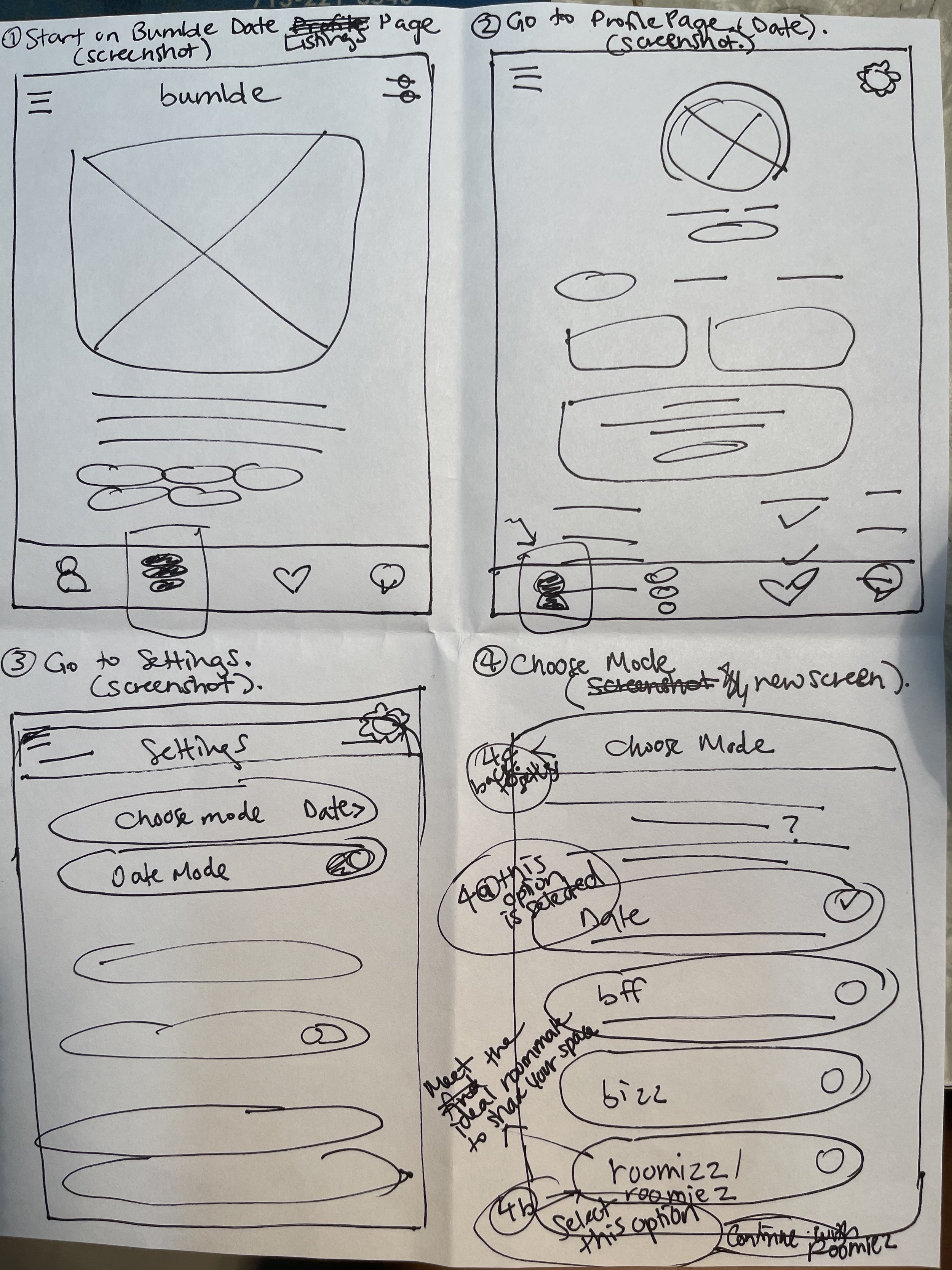
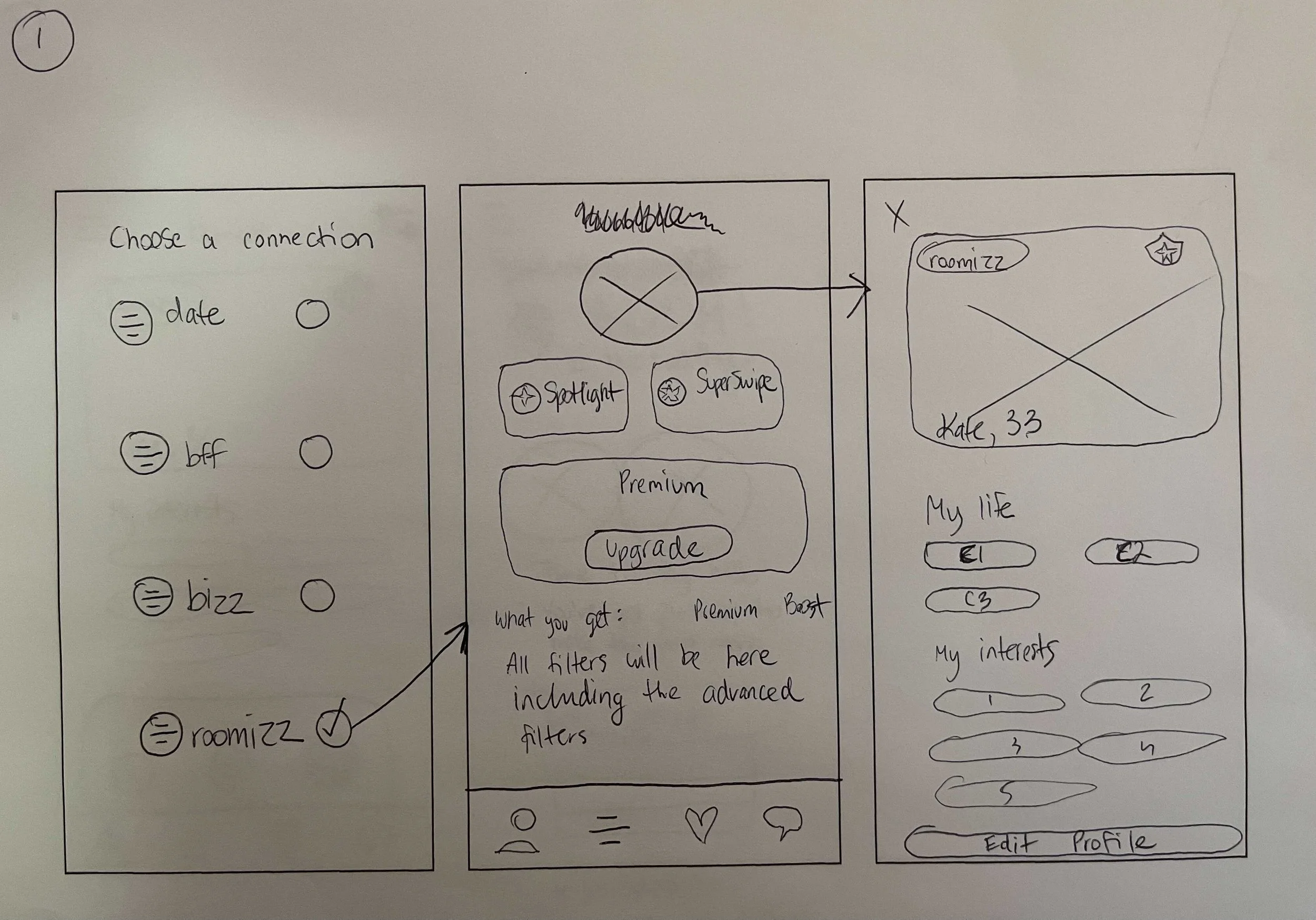
Changing modes from Date to Roomiezz
Changing modes from Date to Roomiezz

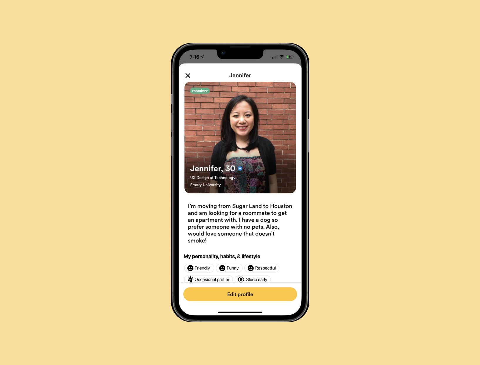
Public Profile (how a user's information is displayed on the app)

Edit Profile (where a user fills out profile information)

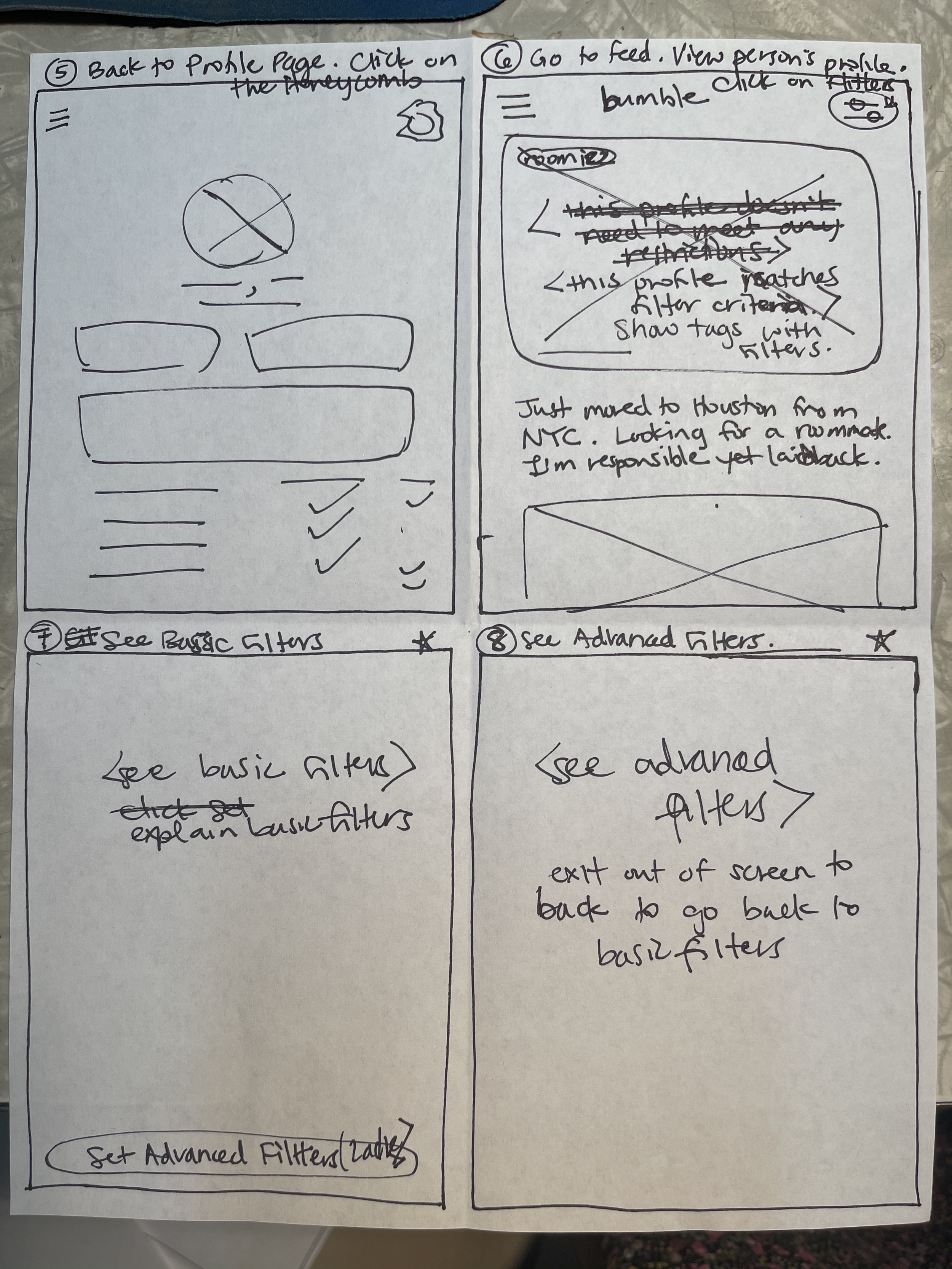
Filters (where a user sets Basic and Advanced filter criteria for the profiles that they.browse)

Roomiezz flow steps 1-4
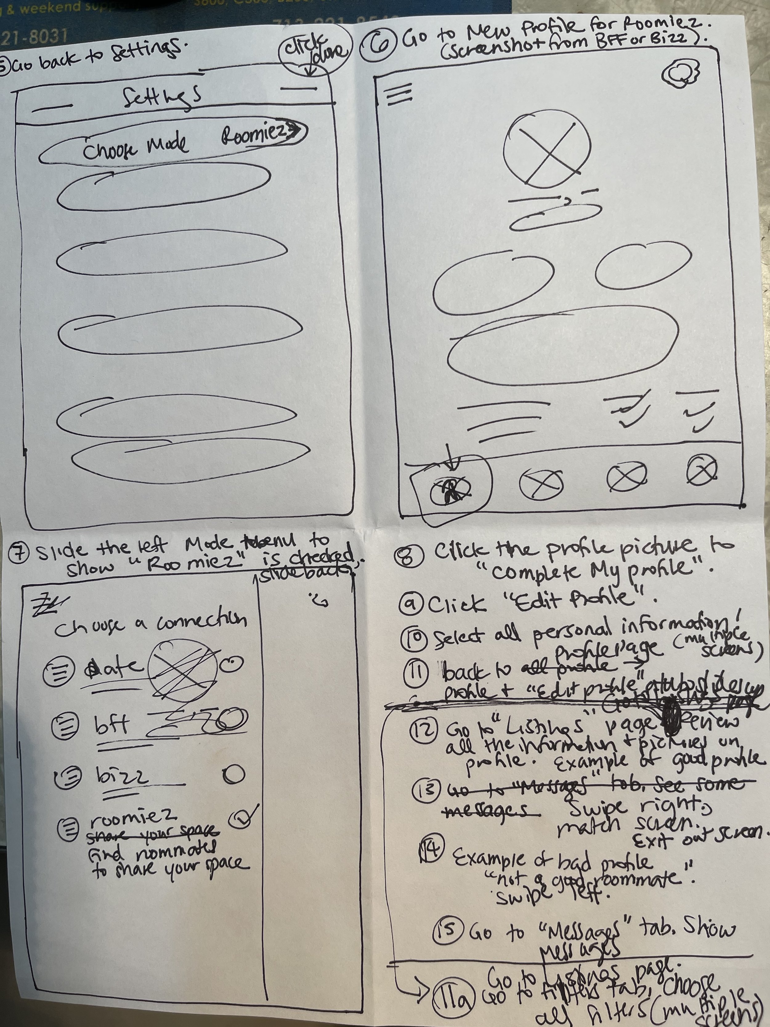
Roomiezz flow steps 5-8
Roomiezz flow steps 9-12

Roomiezz flow steps 13-15
My teammates each also made a series of sketches shown below (scrollable gallery).


We held a design studio where we presented our sketches and decided on the final elements to include in our wireframes and prototype.
4. Prototype & Test
We made a lo-fi prototype to further illustrate our flow.
My teammate made a simple lo-fi prototype.

Next, using Bumble’s existing layout and brand components, we designed high-fidelity wireframes.
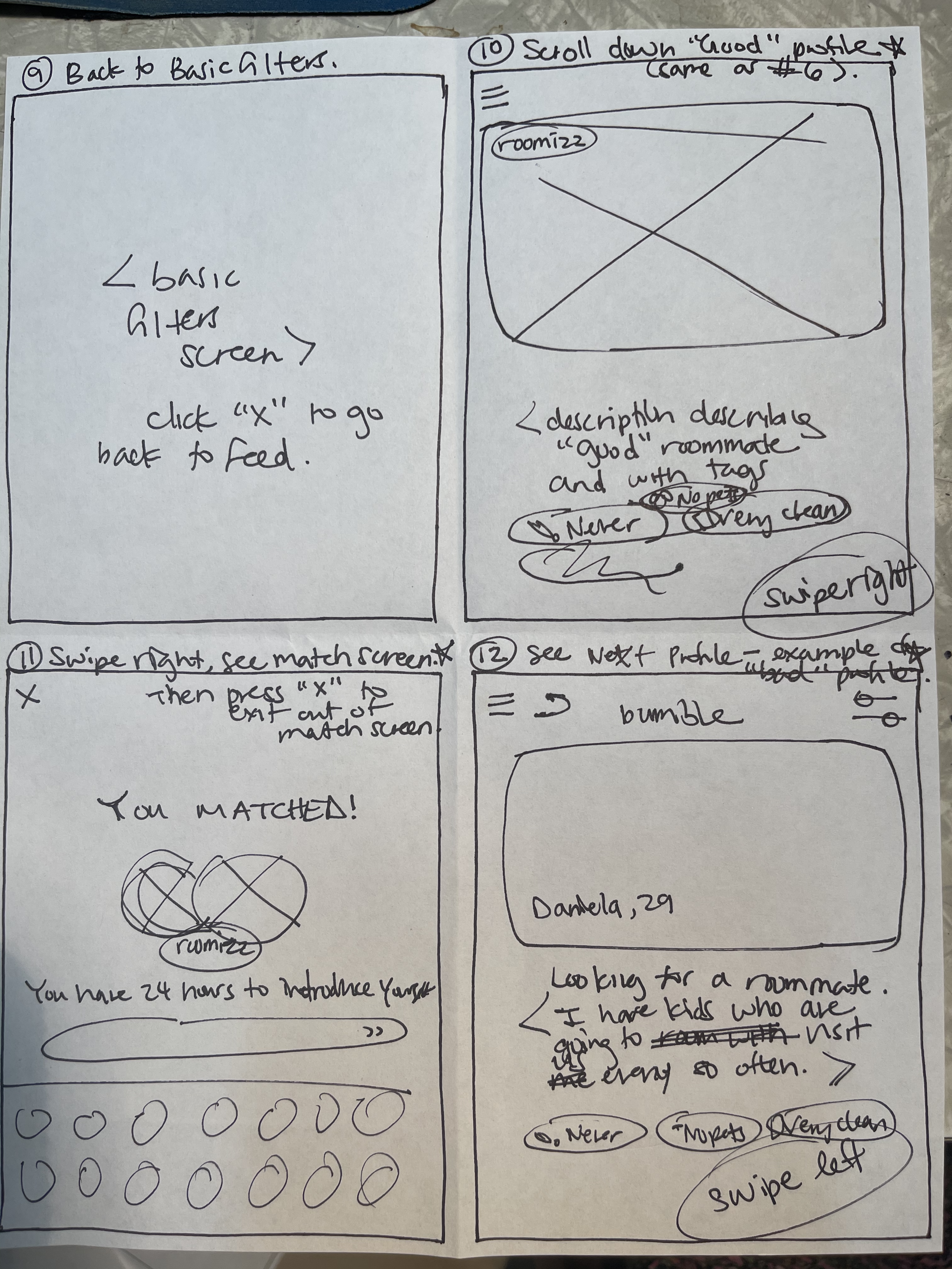
We prototyped a total of 18 screens and divided up the work. I prototyped the first 10 screens (Changing Modes, the user’s Edit Profile, and the user’s Public Profile) and reviewed the entire prototype for brand consistency, details, and writing.
Changing Modes from Date to Roomiezz


The User’s Edit Profile Screen (Scrollable)

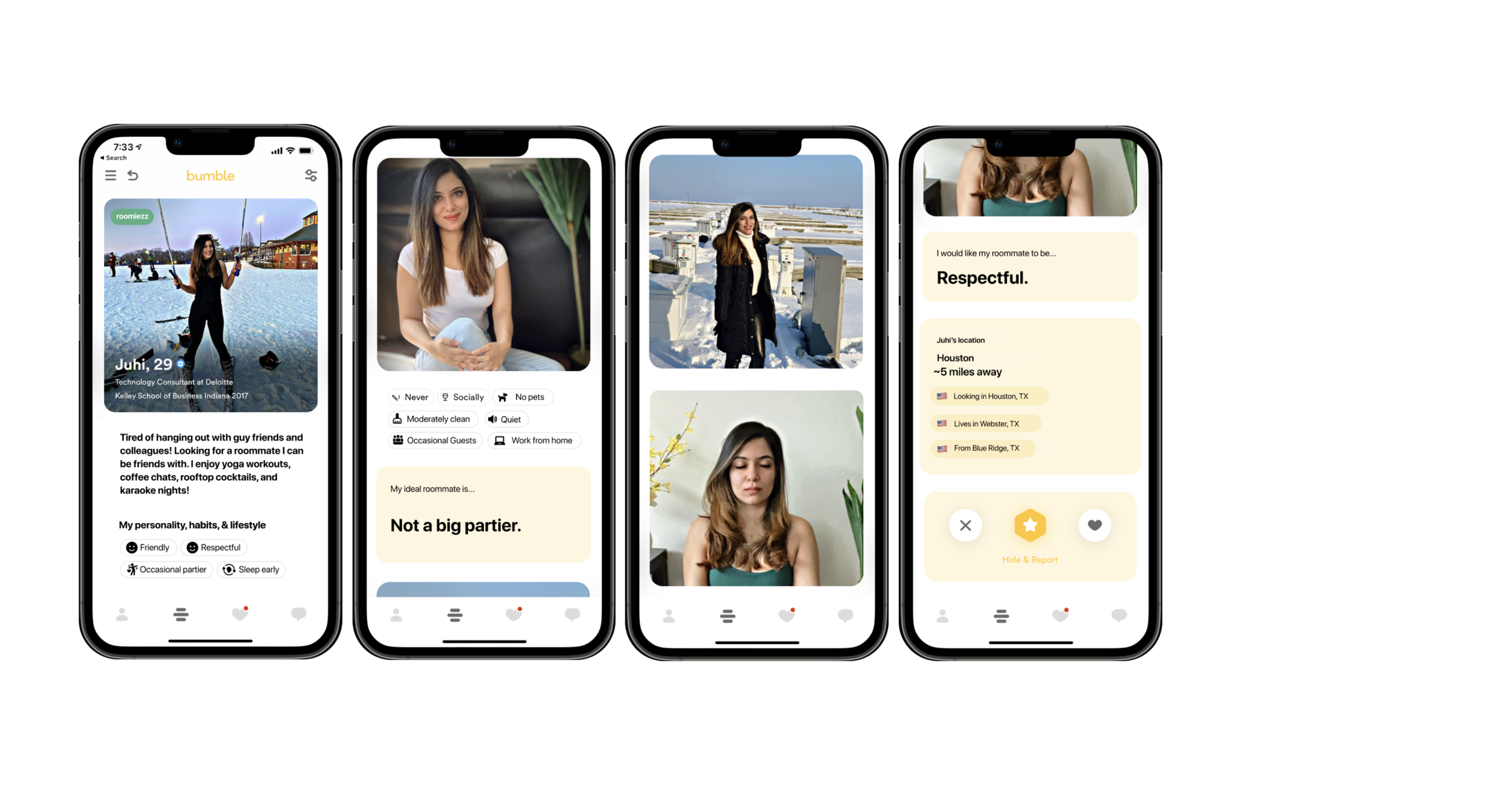
The User’s Public Profile Screen (Scrollable)


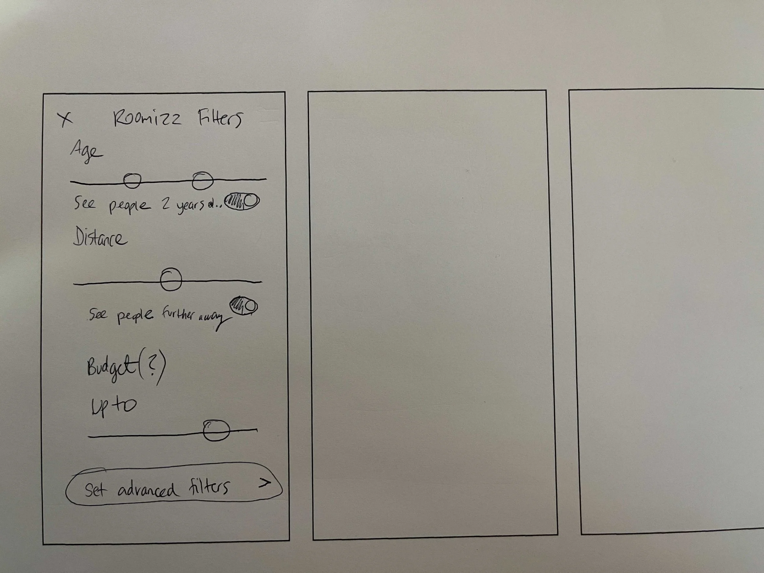
Basic and Advanced Filters

Browse First Potential Roommate Profile (Scrollable)

Browse Second Potential Roommate Profile (Scrollable)
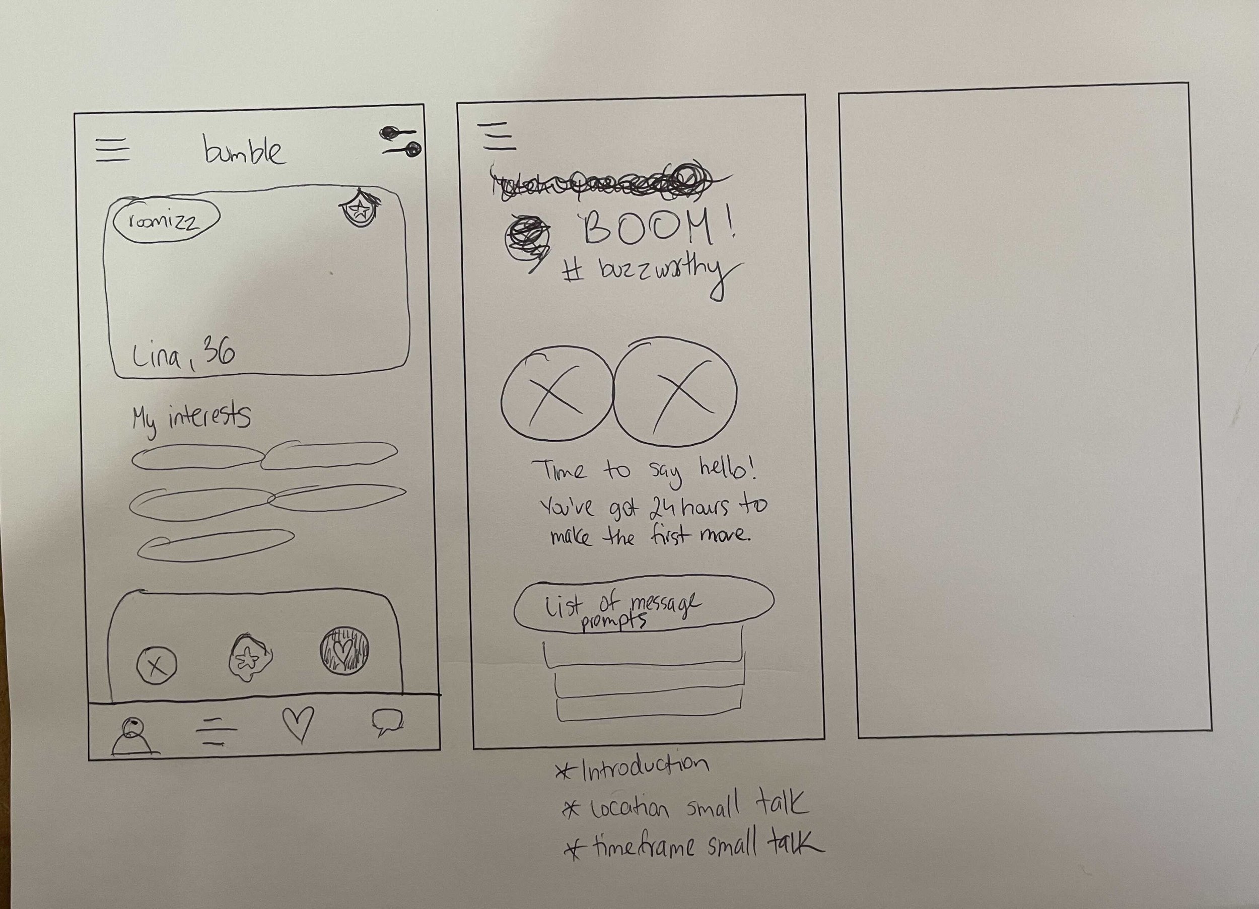
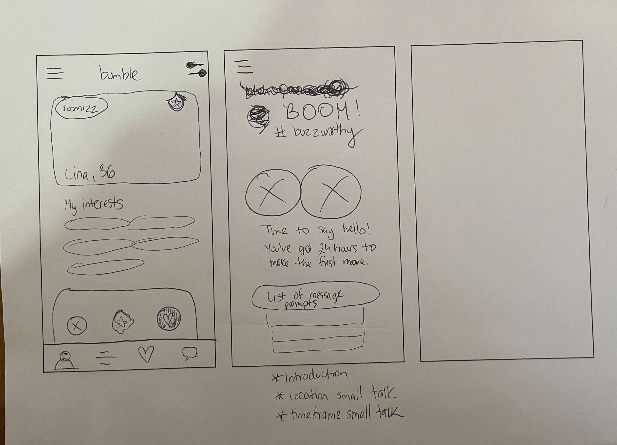
Match and Message with Potential Roommate

We turned our wireframes into an interactive prototype.
We conducted usability tests on our prototype to identify gaps in usability.
The goal of this test is to uncover whether certain key functions of the application are easily findable and usable, whether the functionality, navigation, and labels within the app are intuitive, and whether the app solves the users’ main problems quickly and efficiently.
Our test was conducted with 5 participants total, who have used Bumble and looked for roommates either now or in the past. The test was conducted over Zoom for 2 participants and live in-person with 3 participants, while being observed and moderated. I wrote the usability test, which included 7 key tasks based on user scenarios, and 6 additional questions. I recruited one tester and moderated one usability test.
Watch a video of one of my usability tests.
I conducted this usability test- the participant is Michelle, a 29-year-old former Bumble user who has looked for roommates in the past.

We recorded the results of our 7 usability tasks amongst our 5 participants and discussed them as a group.
You can see the results of each task, the metric, and comments below.

From our 7 usability tasks, all were passed by all users except for one.
The one task that users had trouble with was a task to narrow your roommate search by only those who didn’t smoke or have pets. Users had trouble locating the Filters and Advanced Filters screen to find specific roommates.
Additionally, we asked open-ended questions about participants’ experience with the application and how they preferred the feature’s name to be spelled.
You can see the results of each question and answers below.

From our usability test findings, we came up with a list of recommendations for Bumble.
Since our usability testing feedback involved changing Bumble’s existing flow, we decided not to implement them and instead presented them as recommendations for the company. However, we did change the spelling of our feature from “Roomizz” to “Roomiezz” based on users’ preferences and Bumble’s brand. Here are our recommendations:
Change the placement of Filters to be in the Edit Profile section
Set Advanced Filters to be on the same screen as Basic Filters
Set the “About Me” description to be at the top of the Edit Profile section, which corresponds to how it’s displayed on the public Profile screen
Modify language of suggested openers to be more introductory, such as placing a “Hi!” greeting at the beginning of the sentences
We also suggest Bumble change some text-on-background contrast to stay compliant with WCAG guidelines and be accessible for those with low vision.
We kept an eye on accessibility throughout our designs. While I was examining the app’s settings screens, I noticed a section that seemed to have very little contrast- white text on yellow. We ran this section through a color checker for Web Content Accessibility Guidelines and saw that it failed the test. The results of the test are shown below, as well as our recommendation. (In hindsight, I also noticed that the Basic Filters screen has yellow filters on white background, which should be revised to be darker, such as black.)

